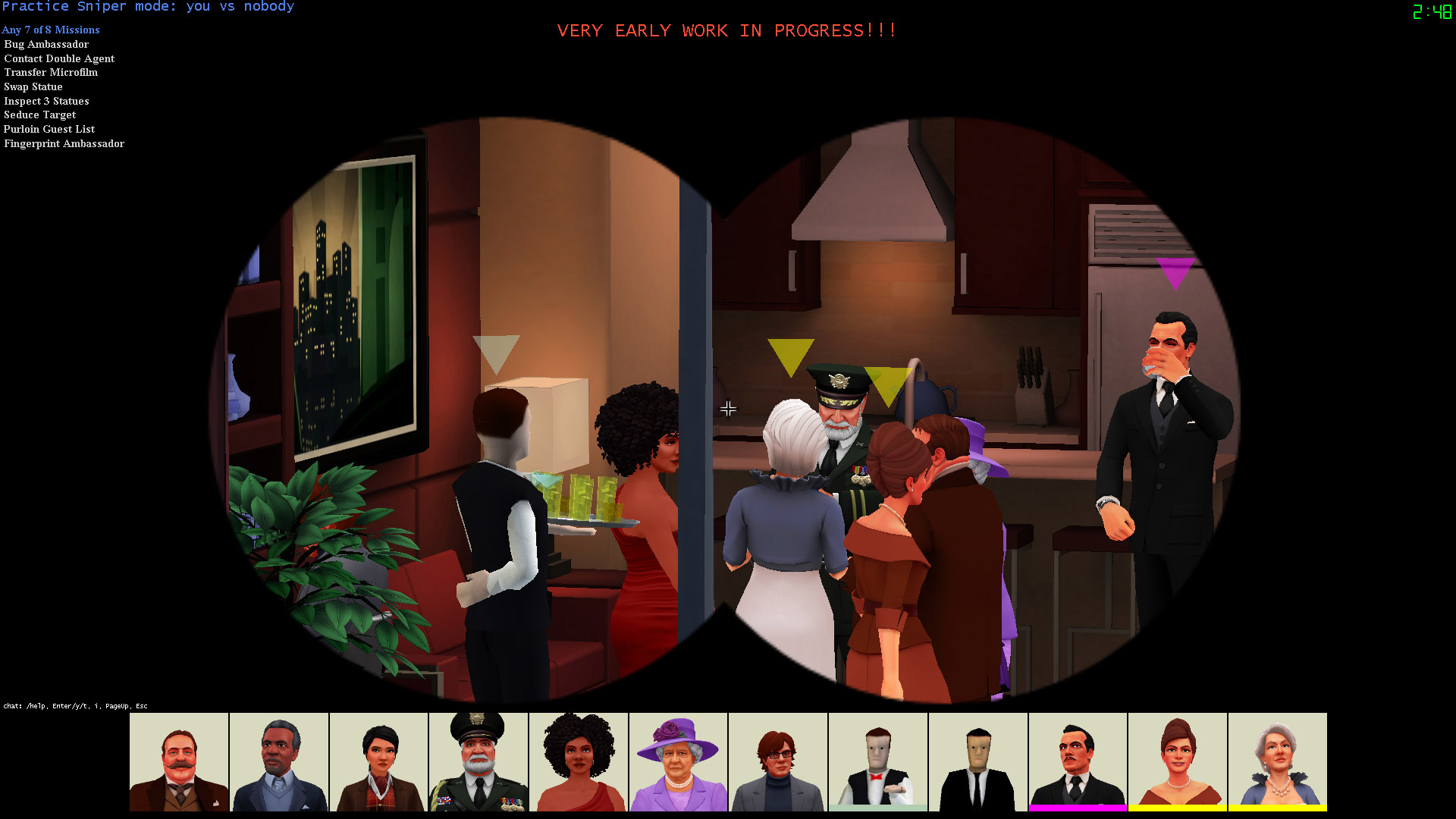
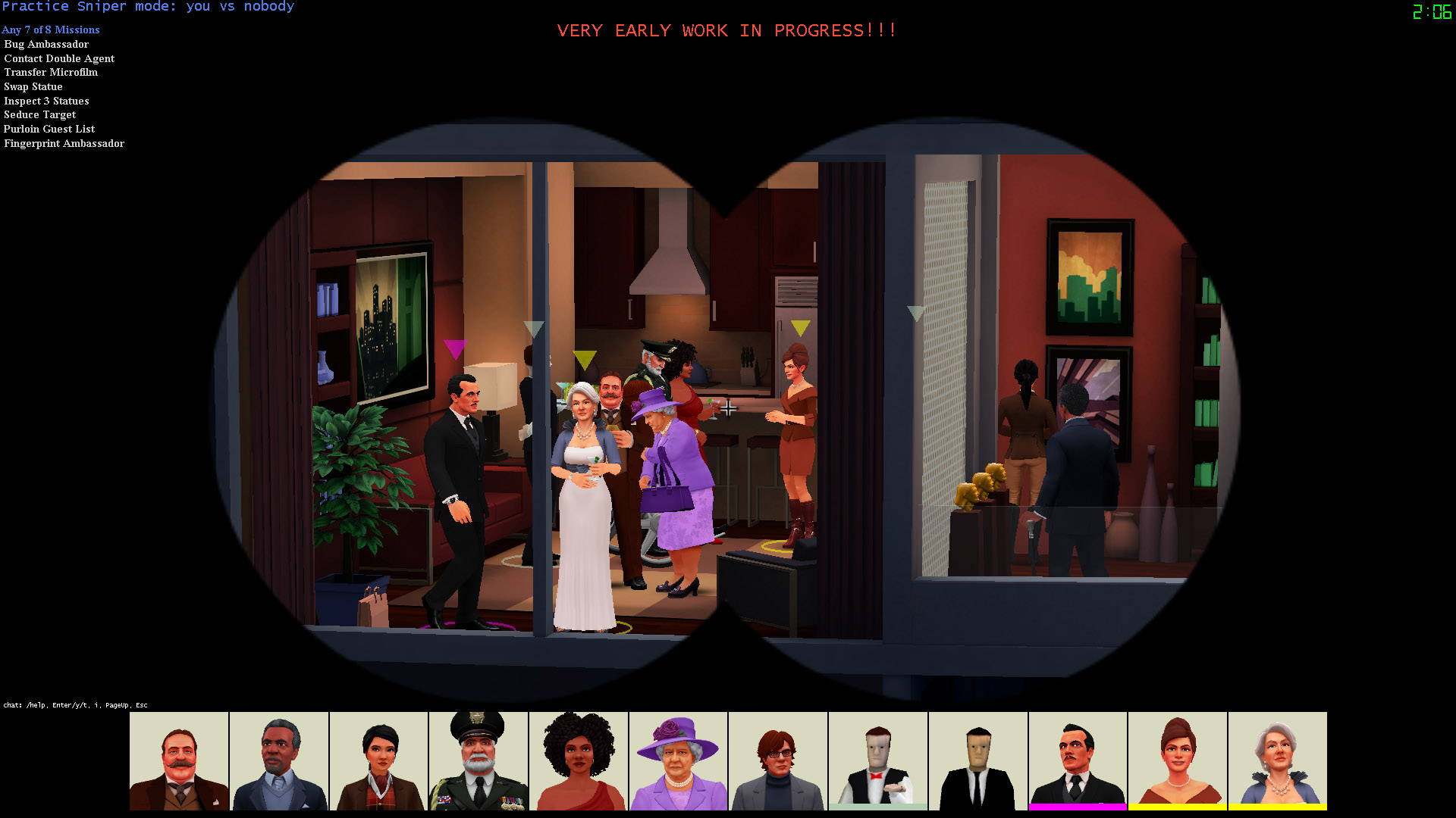
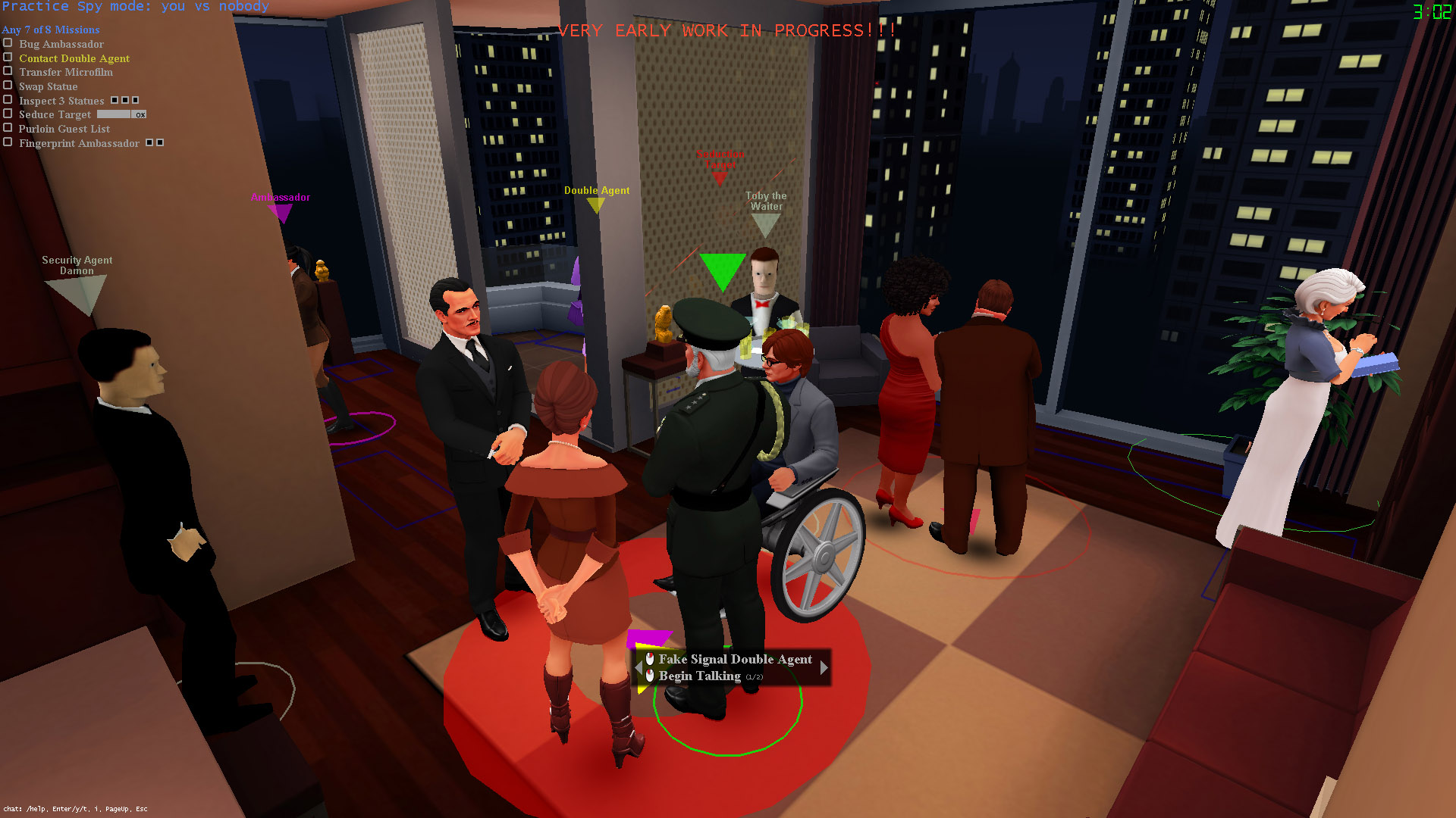
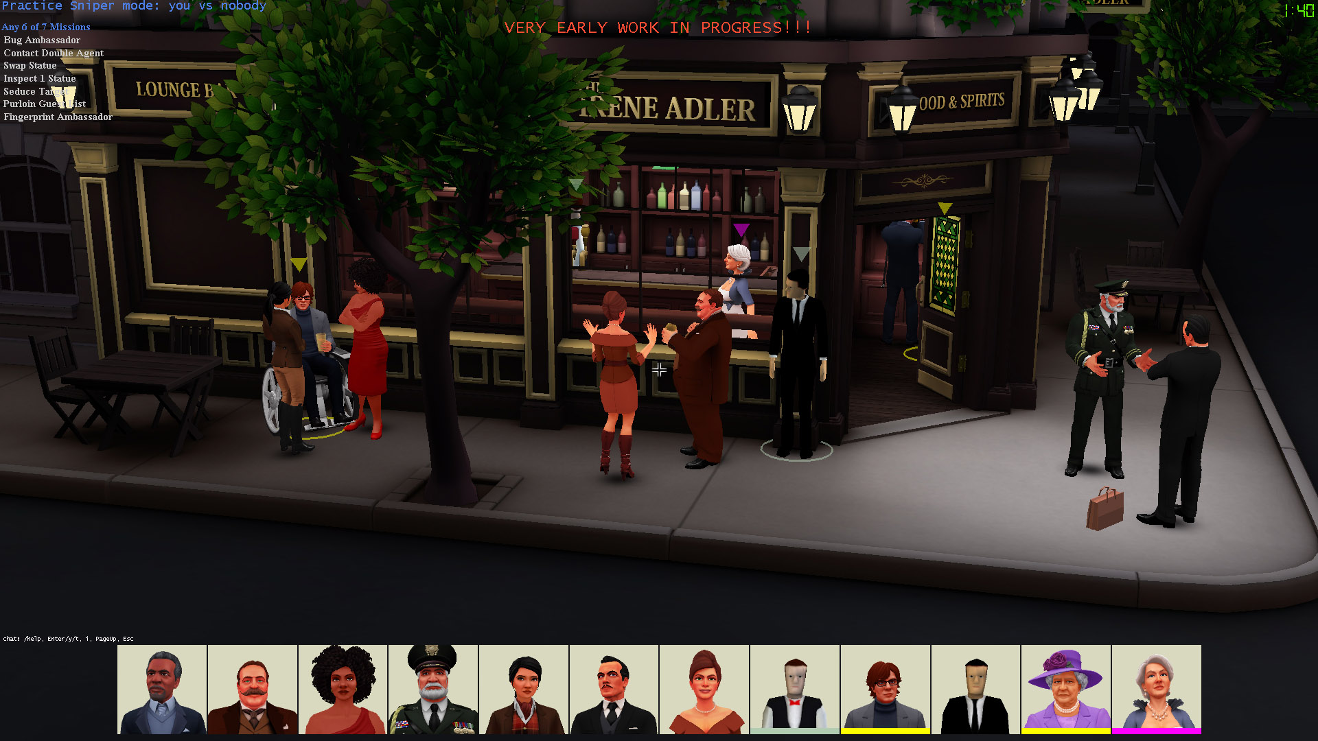
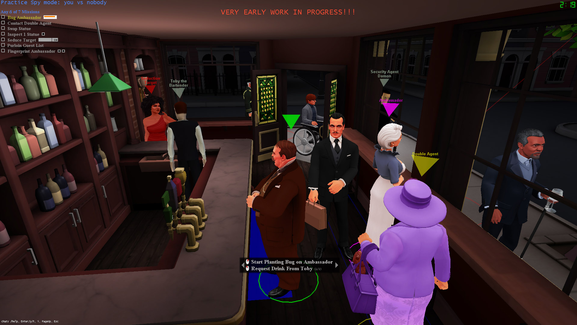
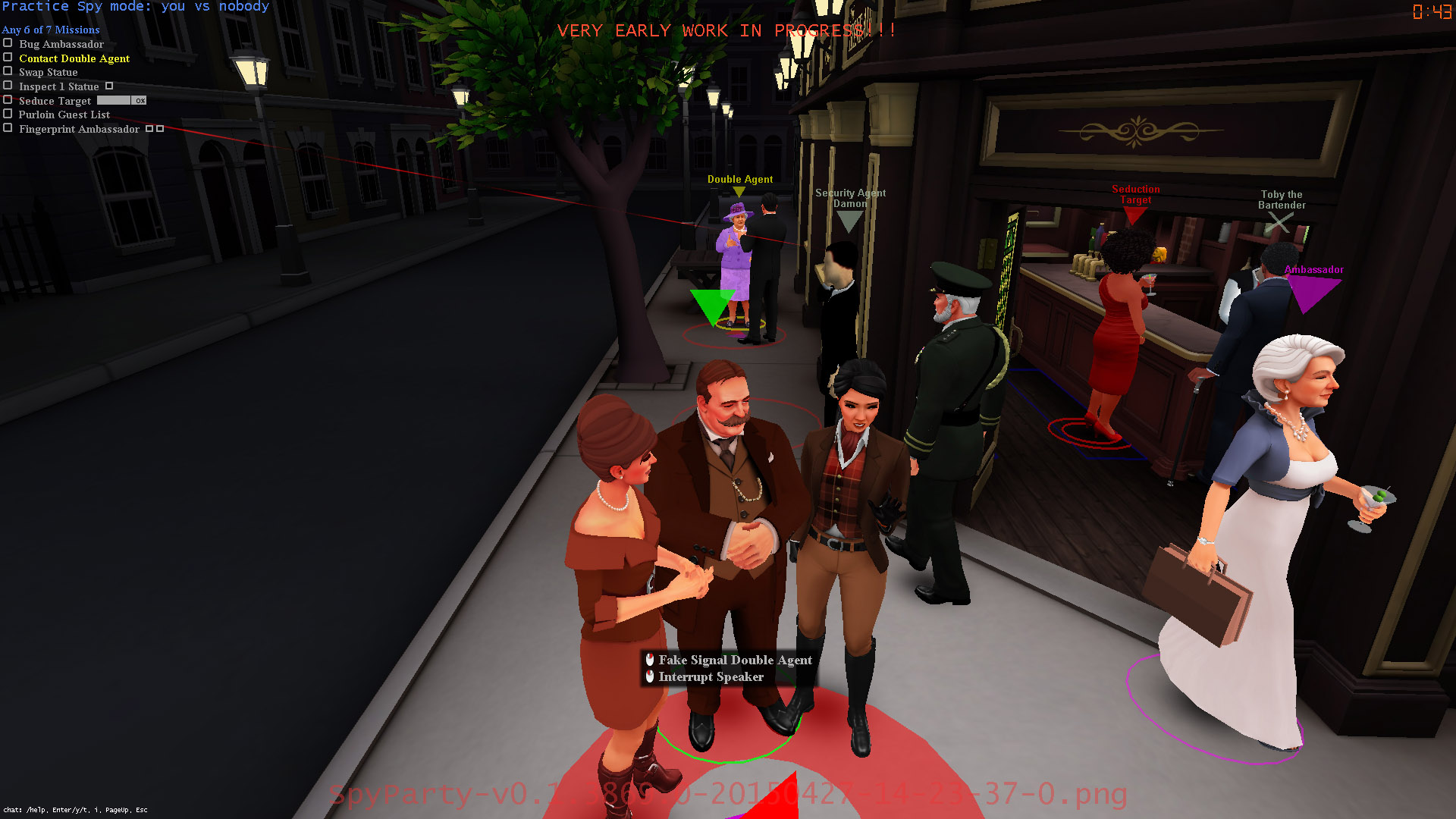
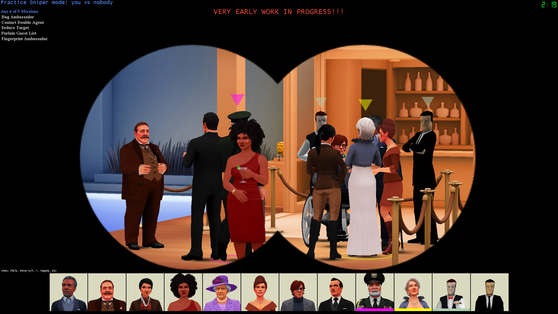
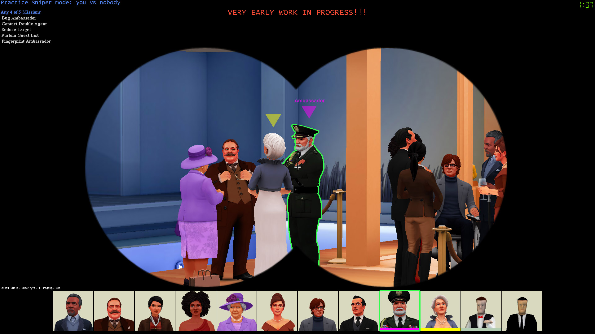
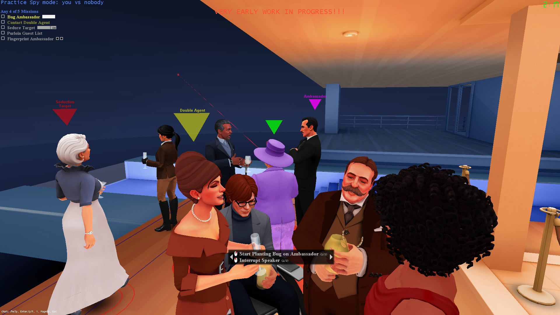
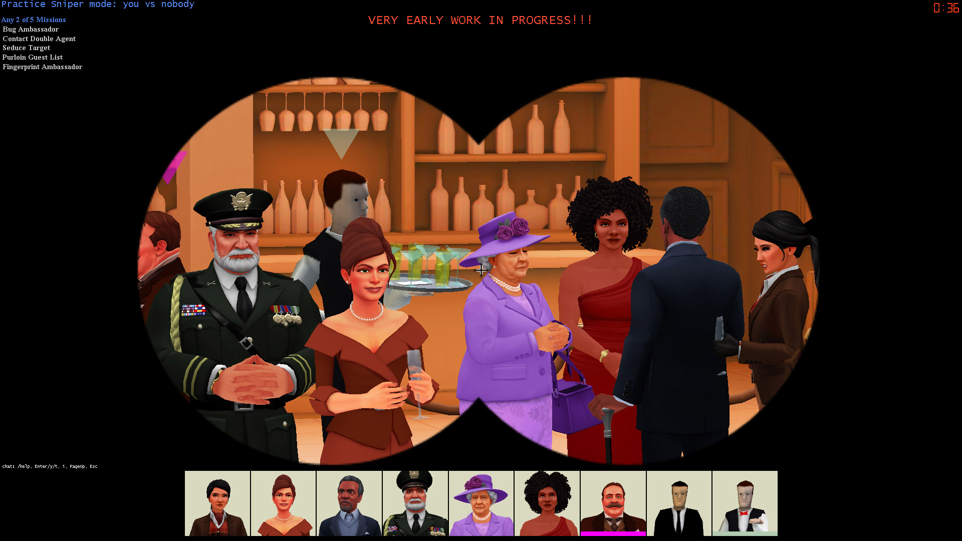
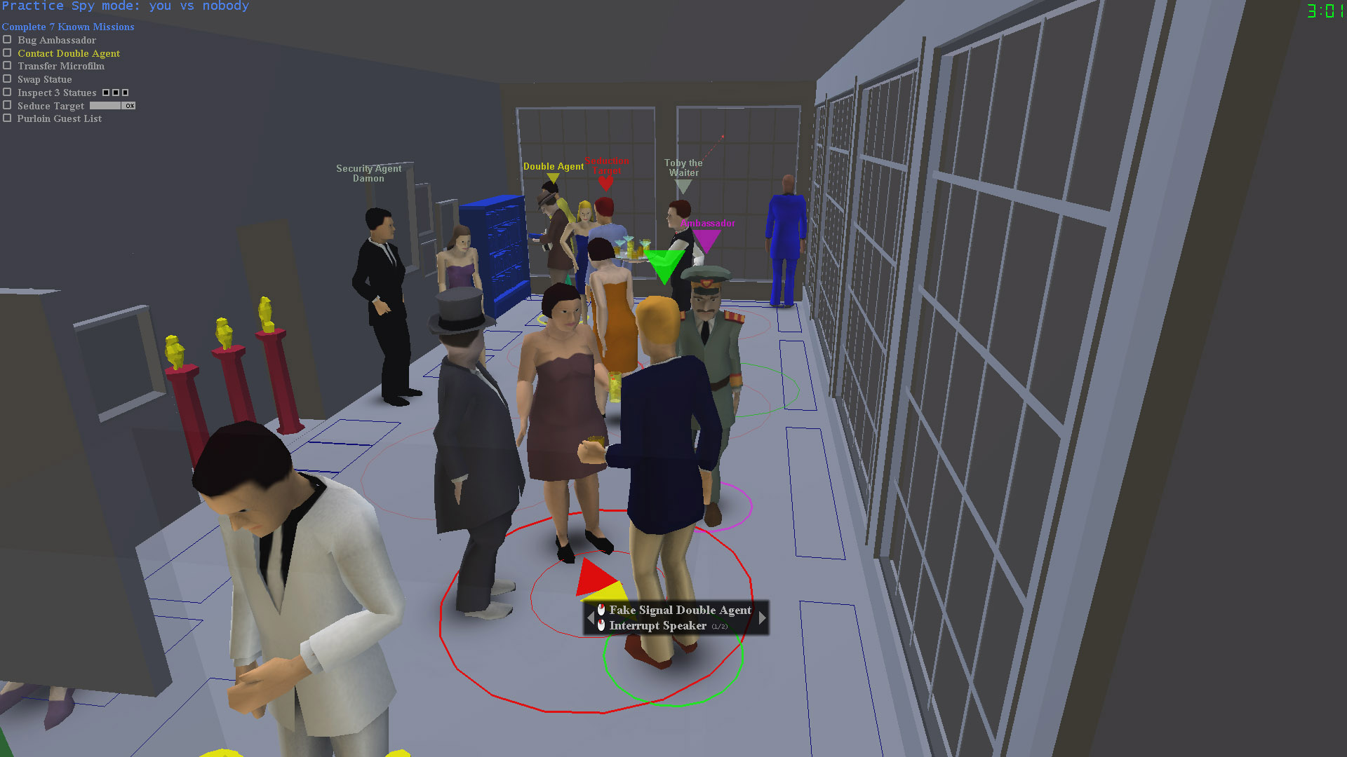
I am incredibly excited to introduce the new SpyParty environment art style! Okay, okay, so we officially revealed the new environment art style back in August, right before PAX, but I never actually posted here on the blog about it. Heck, it’s even running in the game now, so if you want to see it for yourself, sign up for the beta!

Anyway, to make up for my tardiness, in addition to talking about the environment art style, inspirations, and design goals, I’m going to post a bunch of behind-the-scenes shots of the levels and how they look to John in Maya and Photoshop, so you can see how they’re made. Nothing says behind-the-scenes like a screenshot with wireframed polygons in it, right?
We got some great press coverage when we revealed the new environments, here’s a good sample:
- In SpyParty’s Bloodless Cat-and-Mouse Chase, Your Life Ends Here, Evan Narcisse, Kotaku
- SpyParty invites you to the garden party: New art for old environments, Jess Conditt, Joystiq
- SpyParty’s new environments are warm, cool, & Scooby Doo, Patrick Hancock, Destructoid
- SpyParty’s stylish makeover extends to its beautiful new architecture, Michael McWhertor, Polygon
- So, Uh, We Got Chris Hecker To Interview Himself, Chris Hecker, Rock, Paper, Shotgun
The articles and interviews listed above introduce a bunch of the important aspects of the new environment art style, and I’ll go into more detail on each here!
The Style

Finally, we have a place to stand!
The first requirement for the SpyParty environment art style was that it complement the new character art style. Since the game is fundamentally about people and their behaviors, John and I spent a long time coming up with the character art style first, and then applied those lessons to the environment art style. If you want the full background on the overall artistic goals, you should read that post as well, but briefly, we designed the art style to be timeless and illustrative. Timeless means it doesn’t look retro or futuristic, or from any specific time period, it could be taking place at any and all times. By illustrative, we mean we aren’t shooting for photorealism nor cartoons, but for a style that looks like it is the 3D version of the sophisticated illustration work from the early 20th century.
Applying the timeless and illustrative aesthetics to the environments meant we wanted to support a wide variety of architectural styles, and so for the reveal we decided to show examples of the aesthetic applied to both a traditional mansion and a modern one. We needed to test out the aesthetic, and make sure it had the dynamic range necessary to render any kind of architecture we could throw at it.
Because the characters are the stars of SpyParty, we want the environments to fade into the background, but still be beautiful stages on which the parties can unfold. The key to this was to settle on a bi-chromatic palette, with a clear warm/cool separation between the world of the Spy and the world of the Sniper. Our friend, Ocean Quigley, helped us push it even further, by pointing out an old artist trick of increasing the color saturation in shadows, rather than decreasing it as would happen if you just rendered normally in most computer graphics tools like Maya, so shadows go to saturated colors instead of black. As you can see in the images of the new environments, the levels are warm hues wherever the Spy can move and interact, but they are cool outside this area. This will hopefully provide subtle but useful visual feedback to both players about what the gameplay bounds of the level are, and where they need to focus their attentions. There’s actually a third and fourth level of background in the environments, where the 3D modeled trees and the 2D silhouette trees spend their time, fading farther and farther back.
In keeping with our illustrative aesthetic, the shapes, surfaces, and edges should have more of an architectural sketch look, rather than a photographic look. This means very little texture on the surfaces, big, simple shapes, and clean lines.

Frank Lloyd Wright sketch of Falling Water
We’re still developing the aesthetic for the active objects themselves, but the current plan is to use brighter more saturated colors and completely artificial stage lighting to make things like statues and bookshelves pop visually, denoting them as belonging to the foreground instead of the background. I think of old cartoons like Scooby-Doo, where you could always tell when a character was going to pick up a telephone before they actually did so, because the phone was drawn on a cel instead of painted into the background.

If you take these statues a giant boulder comes down the hallway.
Inspiration and Reference
Since we’re going for a naturalistic illustrative style, we want both our environments and characters to be loosely based on reference. We treat real-world reference like Goldilocks treats the temperature of her porridge: we want just the right amount, not too much, not too little. It’s really quite difficult to imagine all the subtleties of an actual physical object—whether a house or a person—if you’re not referring to reference while you’re creating. This sense of authenticity is very hard to achieve and a lot of games don’t seem to even strive for it. At the same time, you need to know when to simplify, and what structures are important for solidity and naturalism, and which are superfluous detail.
The two reference buildings for the environments revealed here are the incredible James C. Flood Mansion in San Francisco:
…and SAOTA’s amazing Cove 6 house in South Africa:
Development
As promised, here’s a small gallery of the environments in Maya and Photoshop. A few highlights:
- You can see how many layers there are in the concept render shot in Photoshop. The finished concept renders don’t actually exist anywhere in 3D, they’re composed of multiple renders and a lot of touchups and post-production to get the look we wanted. This is why the current realtime level doesn’t look as good yet, not only is it not raytraced, but it also doesn’t have the full lighting models and shaders on it that will emulate what John did in post. The concept renders are the visual targets, though, so we hope to get pretty close.
- If you look closely, you can see the triangle-count difference between the concept and realtime Modern map: about 10x. The concept model doesn’t even really have textures on it, it’s all done with surface shaders, while the realtime does to bake in the lighting for performance.
- In the closeups of the bar and fireplace, you can see how John saved polygons when reducing the level, using transparent textures instead of modeling leaves, simplifying shapes, etc.
- Let’s not even talk about the water.
Galleries and Wallpapers
Here are the full galleries for the new environments! The first image in both galleries is a high resolution 16:9 2560×1440 image, suitable for use as wallpaper. The rest are 1280×720. One cool thing is each gallery has a series of images from the Sniper’s point of view, and you can use the lightbox that pops up as a way to preview how the level might look with a rifle in your hands.
First, modern:
Next, traditional:
Finally, here’s the trailer we released last week with the new artwork running in the game:
If you have any questions about the new environments, leave them below!

Never forget!