Some subtle tells and anti-tells, and some fonts leakage: Release v0.1.4434.0
One of the mechanics SpyParty shares with poker is the concept of a tell. In poker, a tell is when a player has some behavior that gives away information about their hand, like whether they’re bluffing. In SpyParty, we use the word tell to indicate something that implicates a character as the Spy; we have hard tells, which are things like animations only the Spy will do, so if you see one of these, shoot the person, soft tells, which are more deductive, like an audio cue that somebody in a conversation is the Spy, and behavioral tells, which are characters acting in a way that raises suspicion.
We also have anti-tells, which is what we call things that only an NPC can do, so if you see one of these, you know you can safely lowlight that character. Hard anti-tells are always high-priority bugs that need fixing relatively quickly, because a good Sniper can get a lot of 100% safe lowlights over the course of a game if there is an extant anti-tell.
These tells and anti-tells are usually very subtle, as this post about a walking anti-tell demonstrates. The finder of that anti-tell, canadianbacon, has become known for finding these, and today’s examples are no different.
So Rude!
First up, sometimes when the Spy would talk, and an NPC would interrupt the Spy, the other people in the conversation would not look at the interrupter. What should happen is the latest person to talk always gets looked at, and I was never able to figure this one out completely, but I think I fixed it anyway, along with three other bugs that popped up along the way.
In this example, the Spy is “yellow Danger”, and “Blondo” interrupts while the Spy is talking, but you can see everybody is still looking at the Spy.
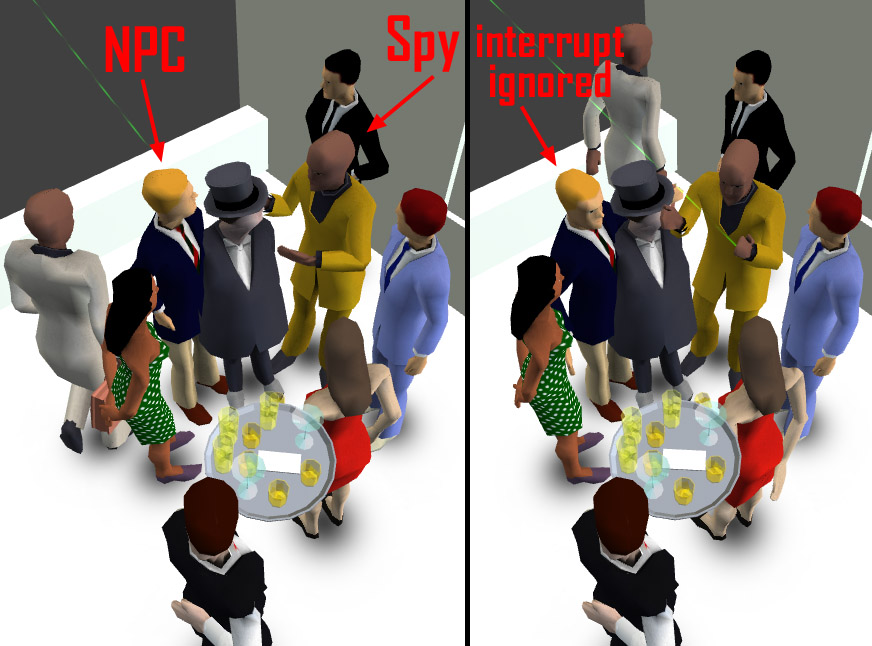
In real life you should ignore people who interrupt, but that wasn’t what the code I actually wrote was supposed to be doing. Perhaps it was trying to tell me something about etiquette.
This is the kind of subtlety we’re talking about. In the bug report thread for this anti-tell, even other elite players were impressed by canadianbacon‘s observation skills. Here’s kcmmmmm, one of the top players, commenting in the thread:
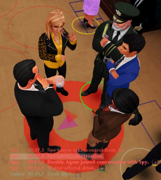
So I fixed this, and while I was in there, I added a long-requested feature. In live games where you’re the Spy, you get to see arrows in the conversations that tell you who is talking, who the previous talker was, and who is going to be next. This lets you exactly mimic the NPC conversation etiquette. These arrows were not shown in replays, though, which made bugs like these hard to narrow down, and also made closely studying the conversation flow harder, so to help debug this problem while I was doing it, and to help with problems like this in the future, I added the conversation arrows to replays and spectation:
I’m a little nervous this is going to get more Spies shot as players like canadianbacon make a study of NPC conversation behavior, but we shall see…
In adding the arrows, I found and fixed a subtle timestamp bug in the replay events, so hopefully those will be a bit more accurate in the future, it turns out they could drift a bit if a bunch of events happened close together. And then there was another bug where the talk spawned by contacting the Double Agent wasn’t changing the previous talker arrow, and potentially didn’t get recognized as a full talk, and that’s fixed too. I’m sure there are more in there that players will find.
Pick a Direction
The second tell canadianbacon reported recently had to do with differences in the way Spies and NPCs stopped when they weren’t stopping on ground pads, so for example to pick up the briefcase in the middle of the party, or stopping before entering a conversation because it became full while you were walking towards it. The (kind of crappy) SpyParty pathing system uses a grid and characters can only path along the 8 cardinal directions (North, Northeast, East, etc.), but in some circumstances when stopping in the middle of nowhere, or in the middle of a turn, the Spy character could stop non-cardinally, and sometimes NPCs could. Hopefully now everybody will always either use the pad orientation, or adjust to a cardinal direction when they stop. Hopefully.
We Fear Change
Finally, I updated this build to fix these tells and anti-tells, but the main thing I’ve been working on has been the new User Interface update, which is going to be huge and buggy and has a ton of work left to do on it. But I needed to fix these bugs now, so I disabled most of what I’d been doing so I could ship the update.1 I could have branched the code from the previous update, but I don’t like to do that if I can help it, and so some of the new UI work leaked into this new build in the form of the new font system.
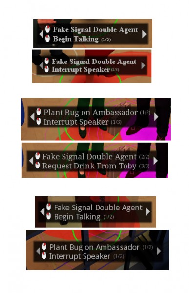
You can see it in a few places. First, the action UI has a new look because I needed it to be scalable and anti-aliased. I tried a bunch of different typefaces:
Choosing typefaces is hard, especially for body text, but I settled on Open Sans Condensed Bold, which is free,2 has really amazingly good hinting for small letter sizes, and has a really pleasant weight. Sadly, it doesn’t have an italics or oblique, but it looks pretty good with synthetic oblique3 so unless I can convince Steve Matteson to make an oblique face, synthetic it is.
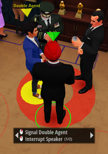
Open Sans Condensed Bold…it still looks a bit weird to me, although now I’m used to it and like it better than the old typeface.
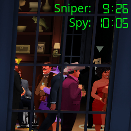
The other place you can see a change is in the game timer. I am using the same typeface for the clock, Digital-7 (mono) by Style-7, but it looks slightly different than before because of the anti-aliasing, and when a “green time-add” splits the clock, I’m temporarily using Open Sans Regular for the “Spy:” and “Sniper:” labels, mostly because the old aliased text looked out of place and was using different measurement units next to the clock. I need to figure out this UI a bit more, but here it is for now:
Okay, back to making the UI pretty! I will show some screenshots of the new UI design at some point soon!




This canadianbacon fellow, although I ‘ve never met him, sounds he’s incredibly intelligent and also madly handsome
Eh, he’s okay.
Thanks for posting these progress reports every now an then. Really looking forward to the finished game!
How long did it take you to try out hundreds of fonts? I didn’t imagine picking the right font would require so much effort.
I put a key in that let me switch between all the fonts really quickly. Most were easy to reject because they didn’t have good hinting, so they were made for print but not for screen. I should do an animated gif of that once I show the UI shots.
Open sans is a fine choice!
Also… any news on the steam release? Patiently waiting!
No news yet…still a bunch of work to do, hopefully before summer!
Interesting choice for a new interface font. Gonna miss the old font, it had a charm to it. By the way, if you’re still hard at work on this game, I have an idea for a new character, and let me tell you, he sticks out even more than a sore thumb does.
Hey Chris,
Do you have any plans to release this for Android?
Seems like a great game for mobile environment both in a local environment (two friends with their phones/tablets on the couch) and across internet.
Cheers,
Mircea