

Three Updates: New Art Veranda!
This is the first in a series of three posts about The “Should Have Been Three Updates” Update, which, as you can probably tell from the name, was really too big for a single update. This post is about the new fancy version of the Veranda level. The next post will be about the new user interface we’re moving towards. The final post will be about the five new characters.
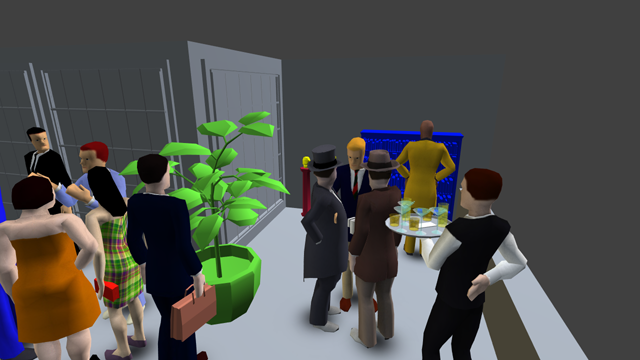
We have updated the Veranda level to the new art style! Check out the difference with the fancy draggy slidery image comparer:
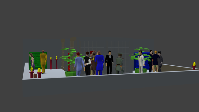
You can drag the handle in this image to compare the versions!
Until relatively recently,1 we had the beta-tester-beloved classic “old art maps” (Balcony, Ballroom, Courtyard 1 & 2, Gallery, Panopticon, and Veranda), and the totally separate fancy “new art maps” (Modern & Double Modern, High-rise, and Pub) done in the new environment art style. The old art maps were all tuned and balanced for competitive play, and—equally important—people were used to them, but the new art maps hadn’t been battle-tested to the same extent, and players were still figuring out how the new art characters and maps worked for competitive play.
Of course, everybody knew the old art’s days were numbered, since SpyParty is going to eventually look like a real professional quality video game™, and that meant we’d have to start doing new art versions of all the existing old art maps. We finally bit the bullet and converted the original level, Ballroom, and that worked out pretty well…it played pretty similarly to the old art version, and after a bit of tuning it was accepted into the competitive pantheon.
Well, now we’ve gone and done Veranda.
It didn’t go quite as smoothly as Ballroom.
First off, the Veranda level itself is a lot more complicated than Ballroom. When making maps for SpyParty, we’ve been trying to explore the level design space, meaning we think about the various characteristics that make up how a level plays, so obvious things like the level’s shape, but also sight lines, how much occlusion there is and what kind of occlusion it is, and more. Ballroom was basically a box with windows on two sides. Some things were easier to see from some angles, of course, but you could basically see the entire map from any Sniper position. It primarily had “dynamic occlusion” from characters walking around at the party.
For Veranda, I wanted to make a big level where the Sniper couldn’t see the whole playable area at the same time due to the intrinsic shape of the map.

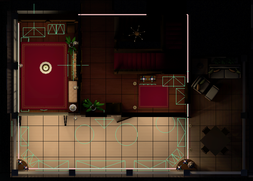
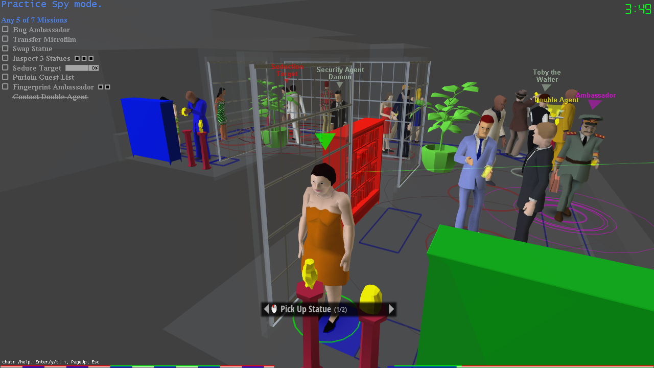
A hastily created map of Veranda’s layout.
As you can see, the green and red bookshelves are on one side, and the blue bookshelf is on the other side, with the center protrusion blocking the view from either side. Veranda has gone through some iteration since it was introduced way back in 2011, but the core “static occlusion” concept it was exploring stayed the same.
We’ll come back to whether it was a successful exploration of this design concept a little later in this post, but one thing we’ve learned is that converting old art maps to new art is made more challenging because we have to work within the often-poorly-thought-out layout that I initially threw down for prototyping, where I was not thinking about whether this was a building that could exist in the real world, I was just trying to make an interesting video game level. Sadly, that’s not enough when the fidelity of the art is cranked up. In other words, we want to keep the finely tuned gameplay the same as the original map—or at least try to hit it as close as possible—so we want to keep all the shapes in the level the same, but that means we have to work with my original proportions, even if they didn’t make much architectural sense.
I definitely had sipping Mint Juleps on a Southern Colonial mansion veranda in mind when doing the original version, but my scales were all over the place, and that center occlusion area makes basically no sense in a real building, so we had to improvise.
First, we always look for reference images. We relatively quickly found a bunch of amazing Southern Colonial buildings with verandas, but The Governor’s House Inn in Charleston stood out as particularly inspiring, plus we accidentally discovered by a misclick that you can walk around and even into the building on Google Maps!
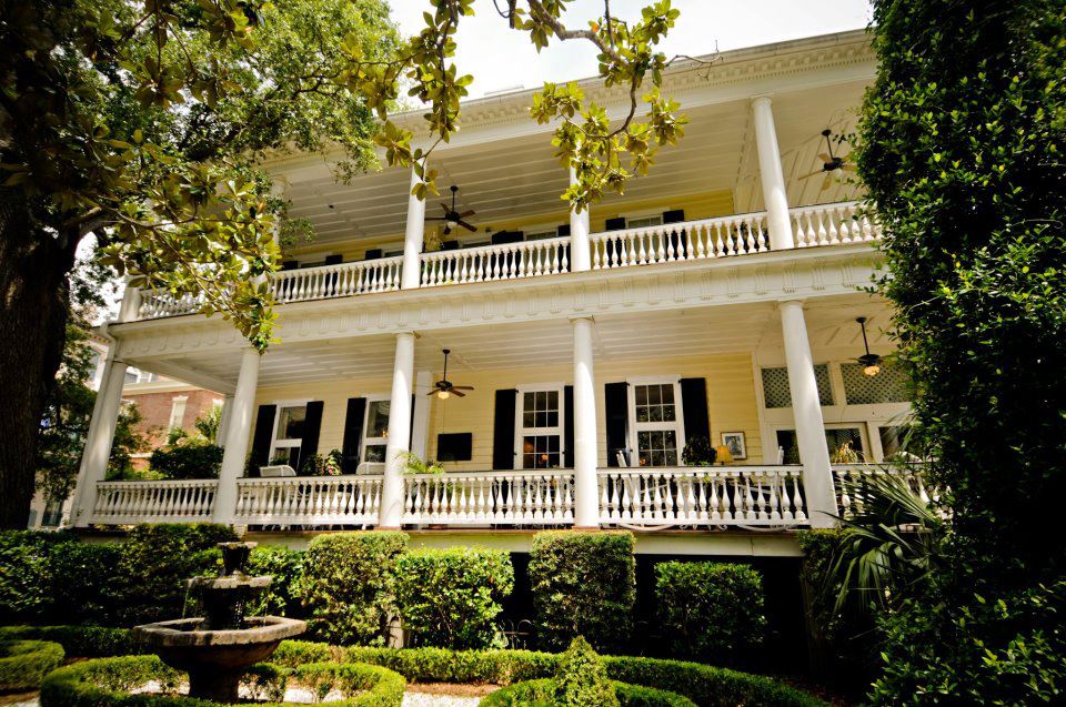
The Governor’s House Inn in Charleston
Then we tried to figure out how to get the shapes right, not to mention explain why there would be bookcases on an outdoor veranda. Books and Atlantic hurricanes don’t mix very well.
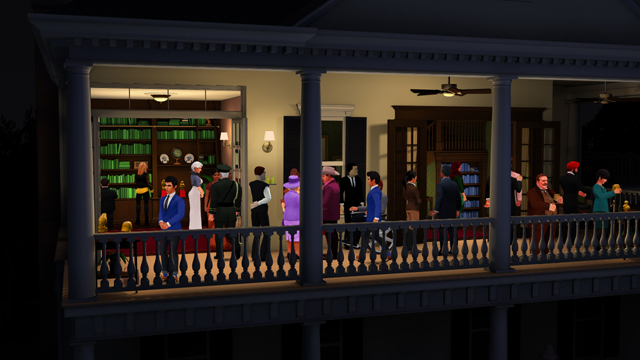
We decided to take a cue from the Governor’s House Inn, which has a remodeled section on the right, and we enclosed the left side into a sunroom library, and then had the right side of the level be actually inside the second floor on a landing, and the veranda keeps wrapping around the house but is blocked off for guests (and is lit accordingly).
The new art Veranda layout.
Here’s another fancy slider so you can see the view on the right side of the level…
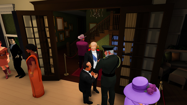
You can drag the handle in this image to compare the versions!
One kind of funny minor issue we had was the front window, near where the security guard stood, allowed the Sniper to see one of the interior statues, so we had to move the clock a bit forward.
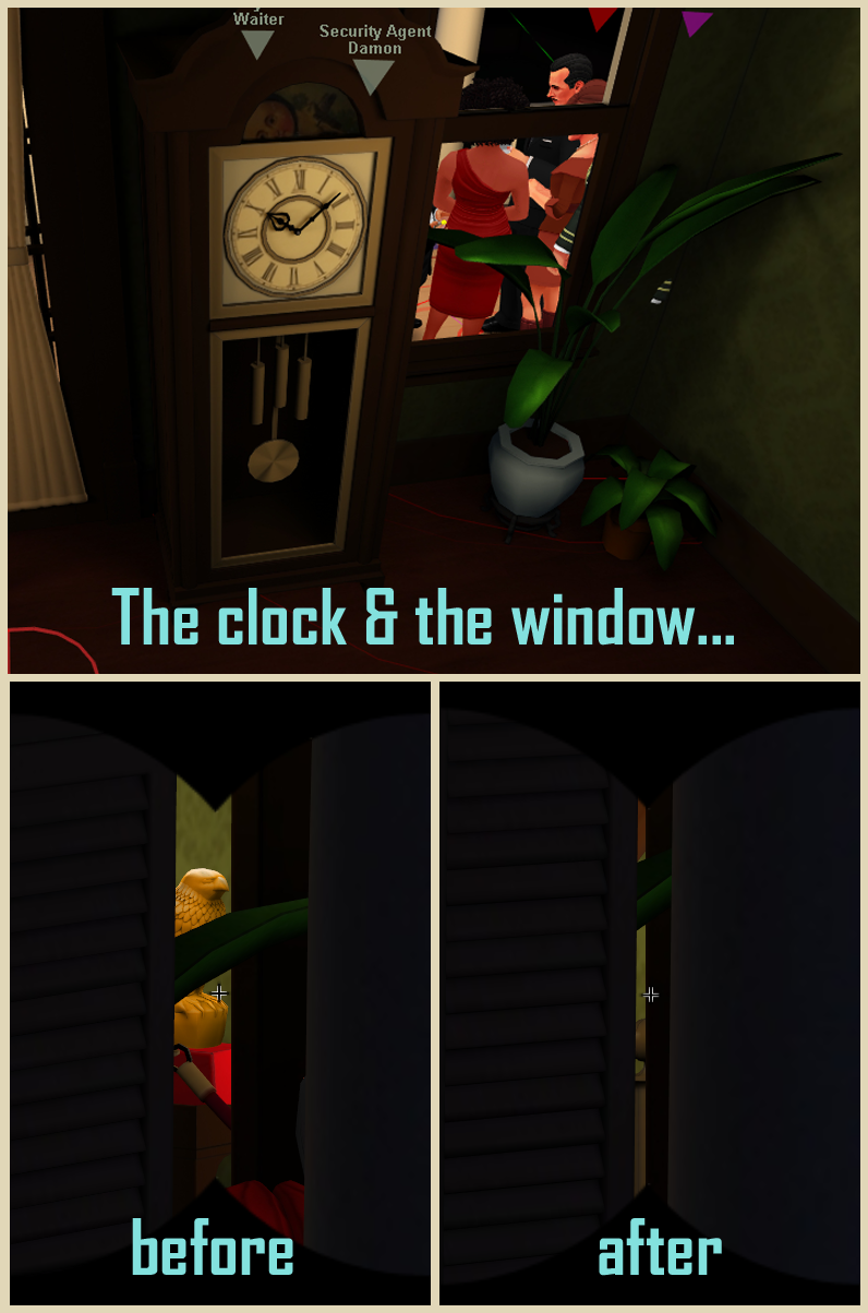
I may have referred to this as “clock blocking”. Maybe.
Another issue with the earlier tests of the new Veranda was I had the Sniper camera too high, which we didn’t notice during development or in the chaos of testing a PAX, but once the level was released and people started playing it in earnest it became clear the Sniper had a commanding view of the party and too much of an advantage. As krazycaley said in the forums, “This is IMMENSELY important for filthy campers2 – it is FAR easier to guard statues on New Veranda than it was on Old Veranda.”
Sweet(er) Spot
Those problems and a few other minor issues were easily fixable, and beta testers report the level is working now, but there is a bigger problem that is not easily fixable and so is going to have to wait: the core design question the level is exploring is not being explored very well because there’s a “sweet spot” where the Sniper doesn’t have to move very much to see everything. And the new art version made it worse.
If you sit near the front-left of the level, you can see enough of the three bookshelves to catch Spies doing microfilm animations, and even though you can’t see the statues on the far right, you can trivially see anybody who goes there and so can check on the statue situation without moving too much.
To compound the problem, we changed the field-of-view of the Sniper camera between the Courtyard 1 and Courtyard 2 levels before we started doing new art levels, to make it look a bit less distorted and give the Sniper a better feeling of being outside and looking through a telephoto lens of some sort. This flattened the depth, which ends up magnifying stuff in the distance in a sense. This made looking at the bookshelves and the statues from the Veranda sweet spot even easier! You can see the difference in this comparison I made with the old art to make it easier to focus on the field-of-view difference:
FOV Comparison.
You can drag the handle in this image to compare the versions!
To fix this I think we’re going to have to modify the level and put the blue bookshelf deeper inside the house, probably around the corner, thereby requiring the Sniper to move to check it.
As if that wasn’t enough Sniper buffs, there was a “wallhax” exploit in the old art Veranda which allowed the Spy to put their camera into the wall and the whole level would turn translucent, giving the Spy much better situational awareness of important things like whether a Double Agent is in a conversation, where the Ambassador is standing, and the like.
Not pretty. Useful, but not pretty.
I am not going to turn this on for the new art, just on principle. I want the new art to feel solid and even once we have a better graphical treatment for how walls go to translucent when the camera interpenetrates them, we’re not going to let the entire map go translucent like this.
To fix this one, I think I’m going to introduce a way for the Spy to pull out and see the entire level from the top as a 2D map with icons, kind of like the image farther up this post. This is all preliminary, but this could be an interesting Spy buff that allows us to put other information on the map view. We’ll let this simmers on the back burner in the old design pot for a while.
So, that’s the story of the new Veranda! If you’re in the beta, just load up the game and hit Play and the update will download and you can check it out. If you’re not in the beta yet and would like to be, head over to the order form and sign up!


Great post. It’s always cool to see the game design challenges that crop up with something as seemingly simple as updating the art style. I love the work you’re doing on this, and I can’t wait to see what else is in store.
Thanks! Two more to come in the next couple days on this update!
super
wery good game
toje tanajlepsia hra
velice moc dobra hra
je to dobrá hra
i seen letsplays on spyparty and i want to play it with my friends
Great, you can sign up on the homepage! http://spyparty.com