It’s happening! SpyParty now has a Steam Store Coming Soon Page! No news yet on the exact date we’ll launch into Steam Early-Access, but we’re planning for early next year and working hard to hit that part of the calendar.
Oh, and it’s in the FAQ, but to reiterate: unless Valve pulls a 180 degree turn and radically changes all their policies in the next few months, which is incredibly unlikely, you will get the game on Steam when it’s ready for testing (probably before it’s actually for sale since I’ll need a bunch of help testing). So, if you want to practice and be a part of the excellent community before all the Steam people come in, join up now!
We also recut the trailer with new music and shots from more levels, and it came out really well, so check that out:
This is the third in a series of three posts about The “Should Have Been Three Updates” Update, which, as you can probably tell from the name, was really too big for a single update. The first post is about the new fancy version of the Veranda level. The second post is about the new user interface we’re moving towards. This final post will be about the five new characters.
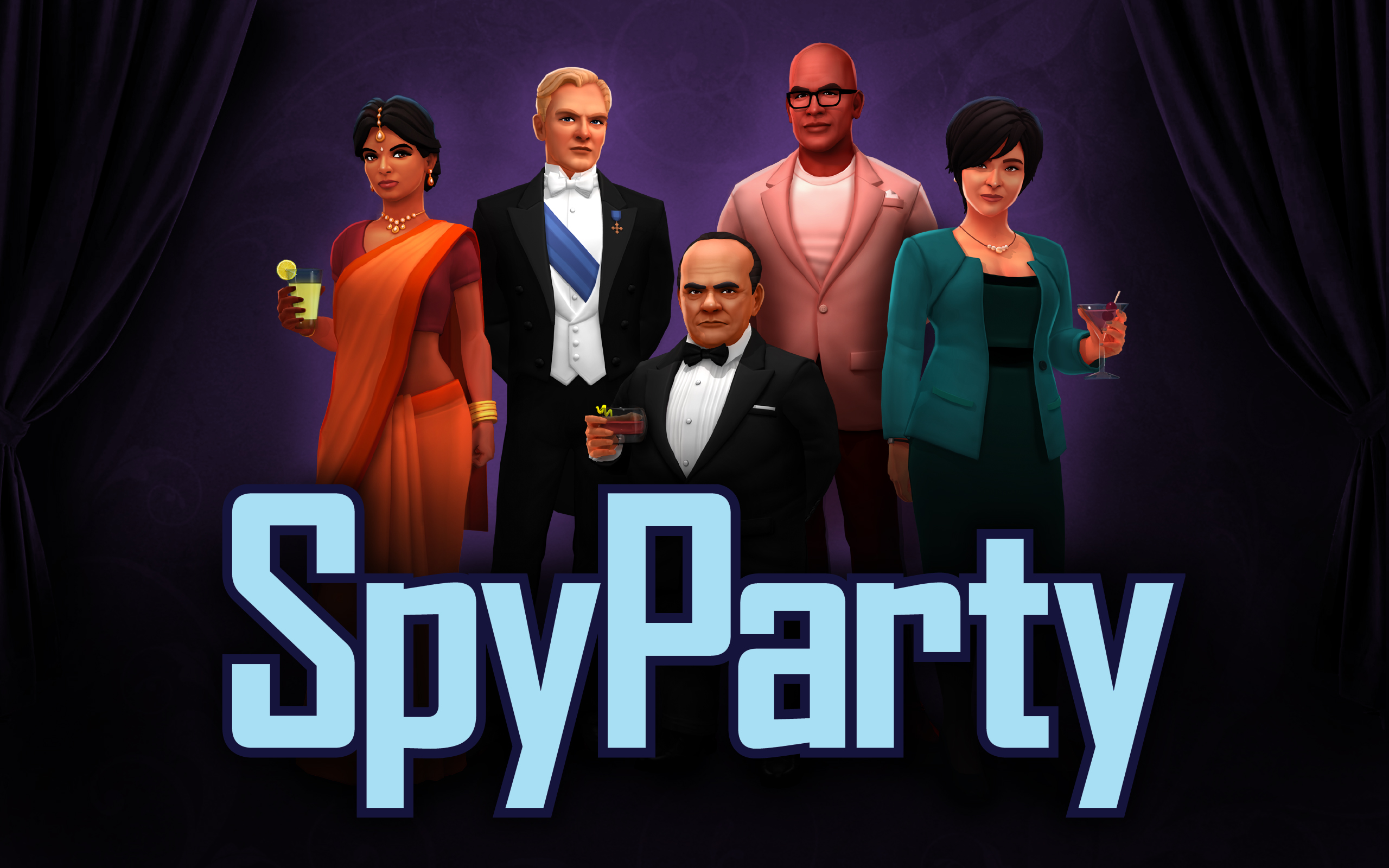
And we come, finally, to the final bit of exciting news about The “Should Have Been Three Updates” Update, the latest group of 5 new characters…check them out!
Meet the newest guests at the SpyParty!
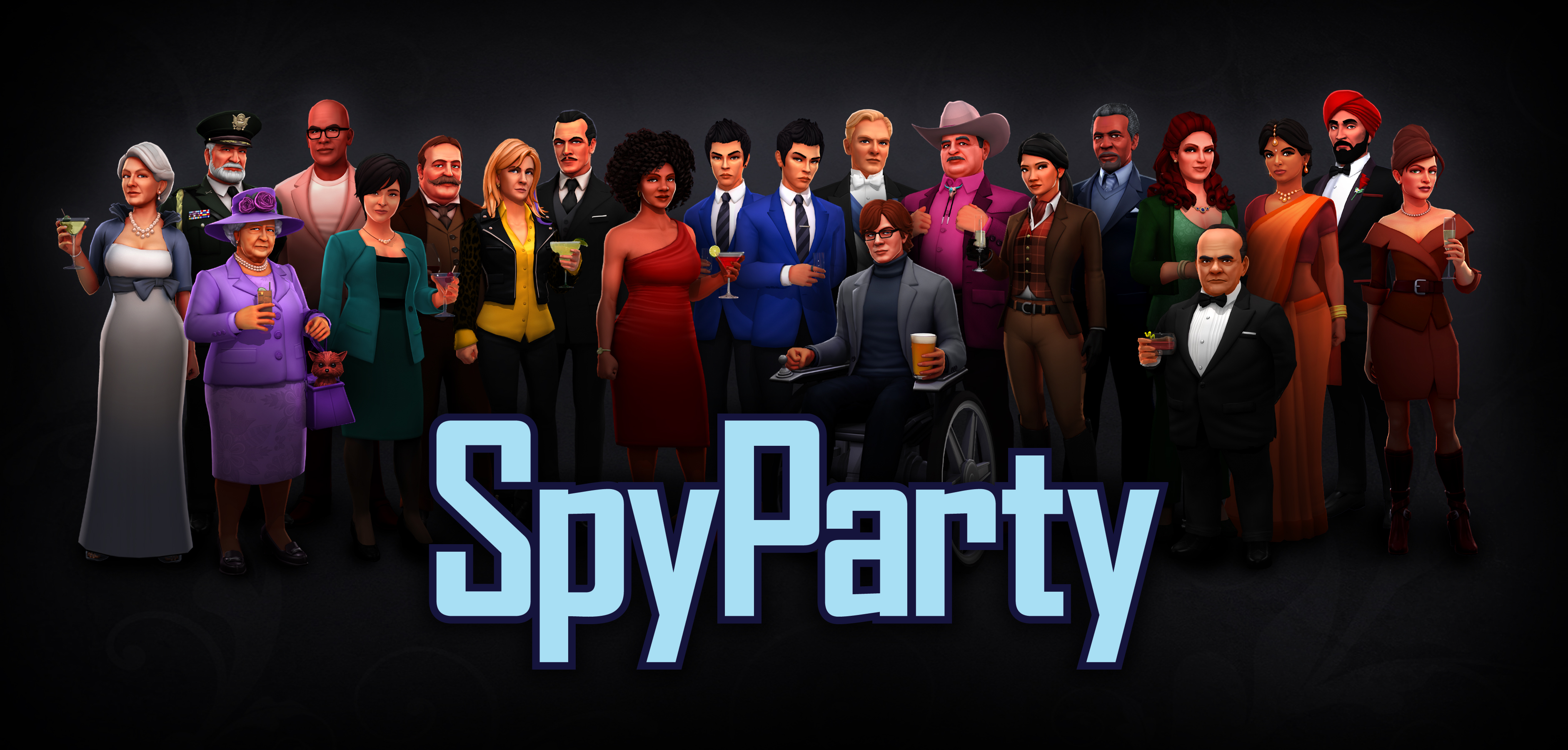
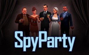
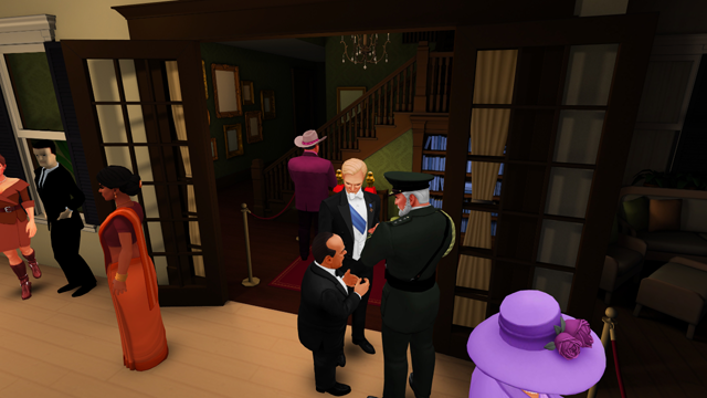
And here’s the whole cast:
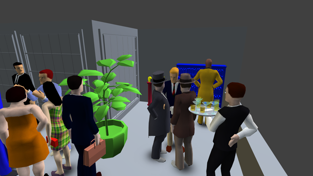
It’s getting crowded at this party…
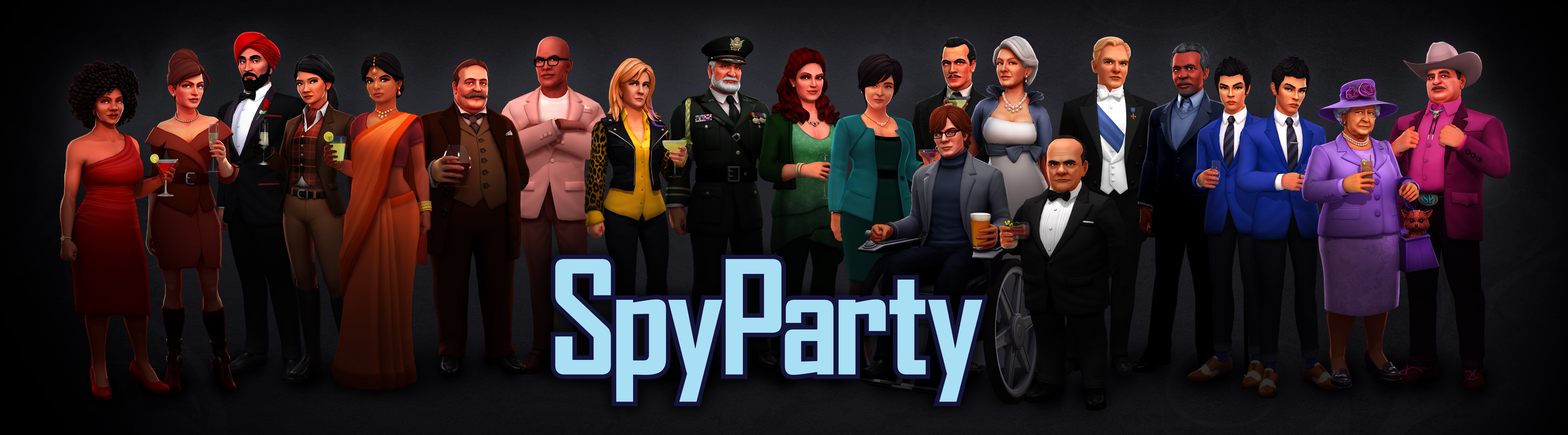
That group shot looks pretty cool, but with this latest group of characters we wanted to round out the color palette of all the guests, and so we made this rainbow image, which just delights me:
Look at the pretty rainbow!
No one can say SpyParty is a brown-and-grey game!
Also, due the the twins in the new art, there are now more new art characters (21) than old art characters (20)!
Diversity
As usual, one of our design and art direction goals is to make the party guests as diverse and interesting as possible across many different axes, including race, height, weight, gender, age, etc. In a strange twist of fate, we realized we didn’t have a blonde haired white guy in the game yet, so in order to make the game more diverse we had to add the most stereotypical non-diverse dude in video games, but hey, science is not about your feelings. This batch also includes an Asian business woman, a young Indian woman, a dwarf man, and a tall black professorial type guy.
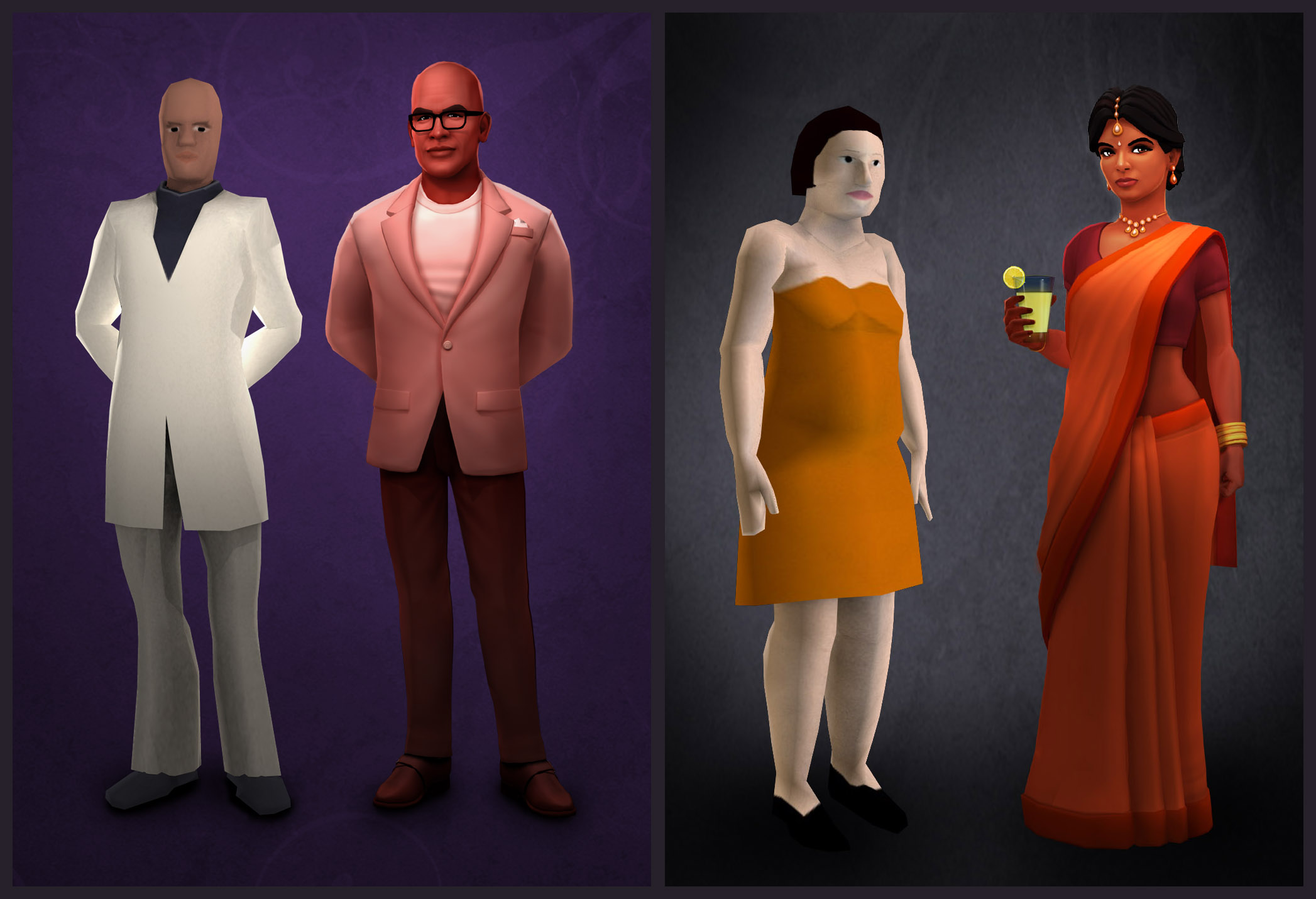
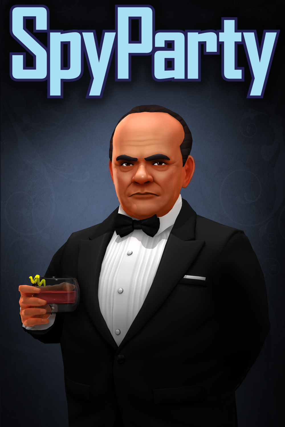
This time around we have two more updated characters, Mr. Q and Ms. T. You can see comparison images below; Mr. Q is an updated version of Danger P. Johnson, one of the “Danger Brothers”,1 and Ms. T is an homage to Virginia Vulpes, a.k.a.”Orange Dress”, one of the most cult-popular characters in the old art. There have been tournaments won and lost around the meta of whether somebody is playing Orange Dress or not.
I’m not going to say they’re better, just different.
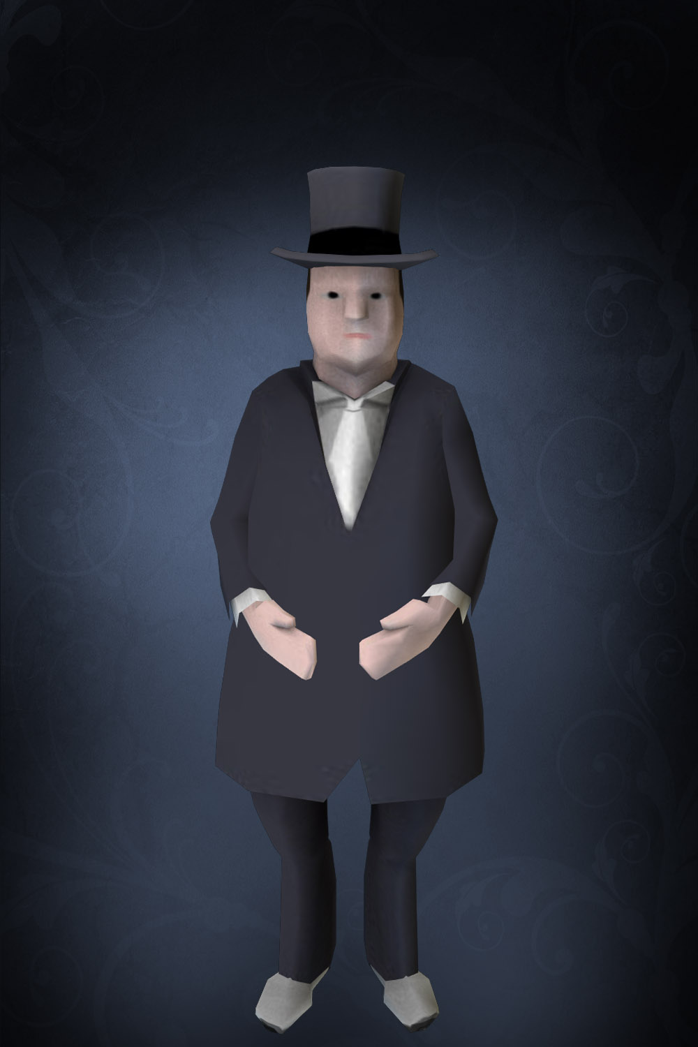
Mr. Q
We always knew we were going to update one of the Danger Bros to be in the new art cast. The original Danger Bros are often called White Danger, Blue Danger, and Yellow Danger, and so some folks have suggested Salmon Danger as Mr. Q’s nickname, which inspired somebody to come up with the nickname Salmon L. Jackson, which is terrible. I think he’s our tallest guest, although I think the Sikh turban stretches a bit higher.
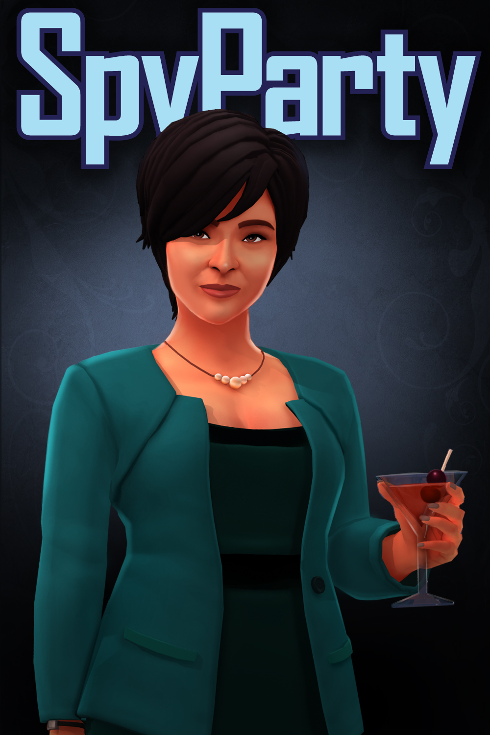
Ms. R
She’s inspired in part by Yang Lan, sometimes called “the Oprah of China” for her media empire. She obviously drinks a Manhattan, and I’m wondering if she’s the only playable middle aged Asian business woman in video games.2
Mr. S
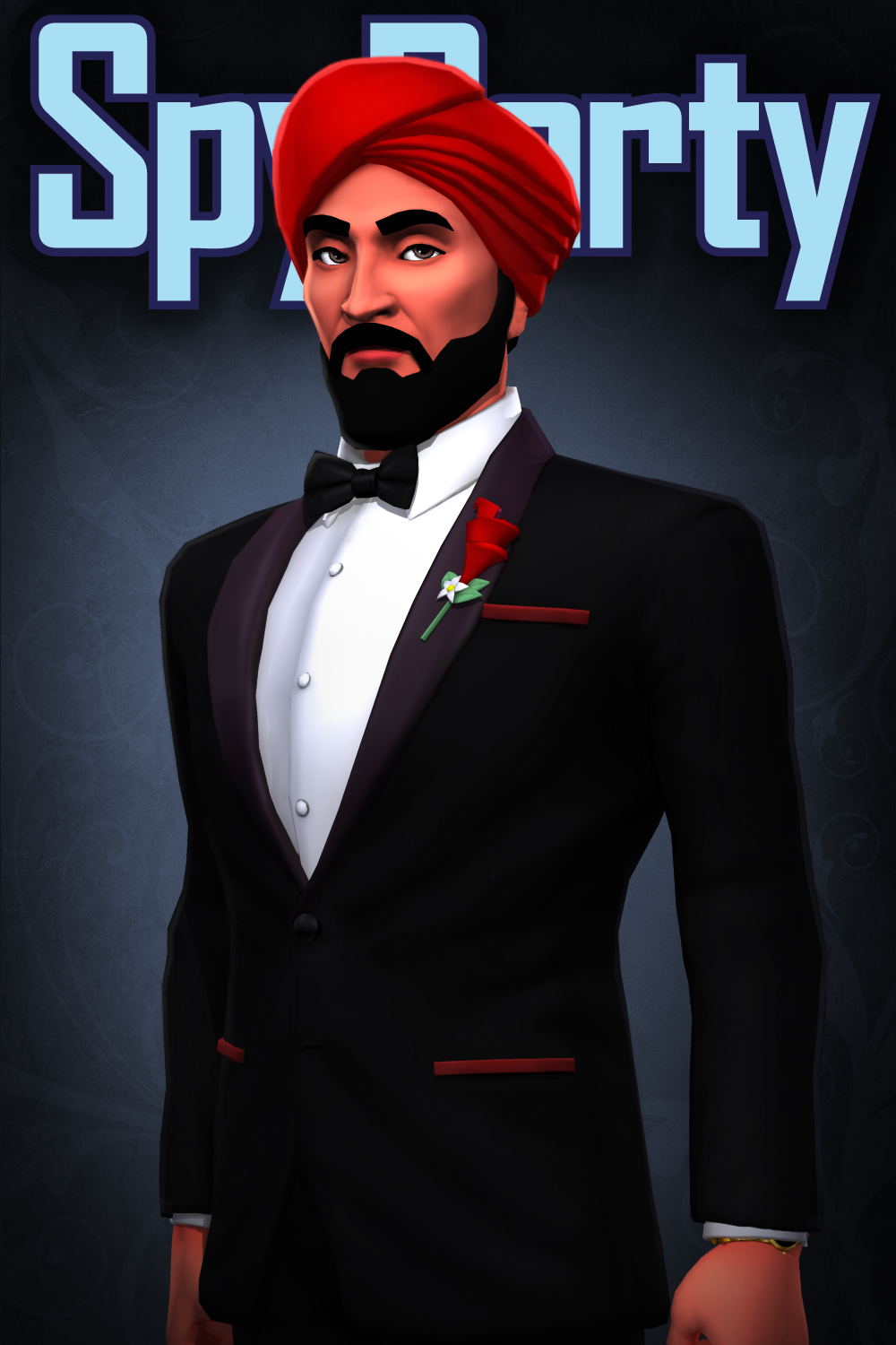
If you thought Mr. I in his wheelchair was hard to see behind a crowd of people, now you have Mr. S to contend with. He’s a dwarf, which according to this FAQ is the non-offensive way (along with “little person”) to refer to someone of short stature. His face was inspired by a combination of Silvio Berlusconi and a few other actors, and I think he looks a bit like a crime boss…not that I’d share that opinion at the party. He’s impeccably dressed in a tuxedo, matching our Sikh, Mr. K, in the second tier of male formal attire, under Mr. U, below.
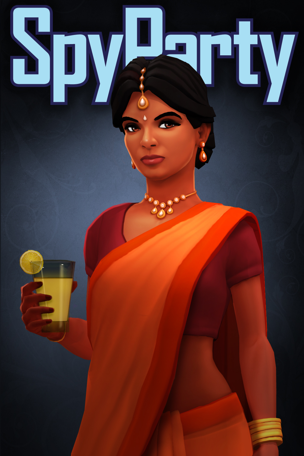
Ms. T
Our first guest from the Indian subcontinent, Ms. T and her bright orange sari brings a splash of warm color to the party and throws a bone to the Cult of the Orange Dress in the new art style. She’s drinking a glass of shikanji, an Indian lemonade.
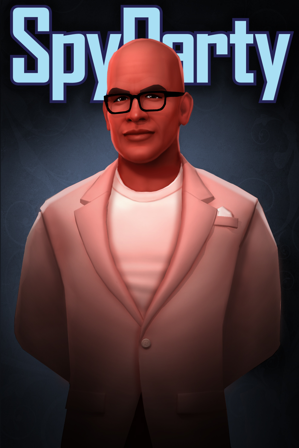
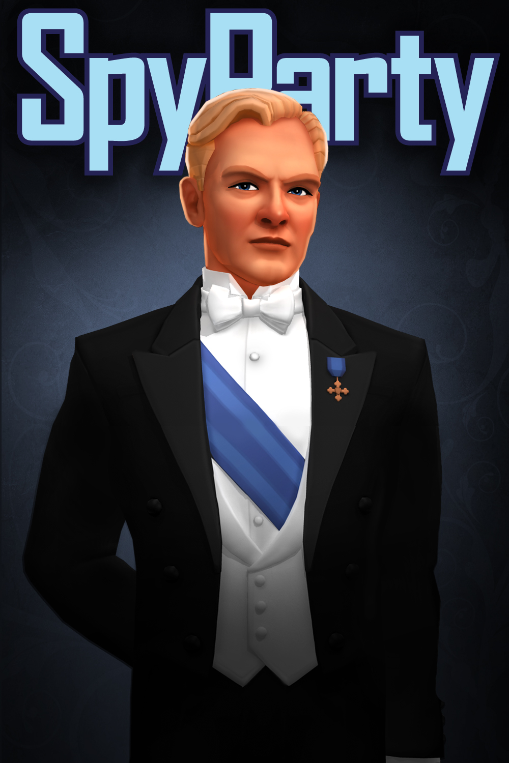
Mr. U
A mentioned above, we were in the unique position of actually needing to put a blonde white guy in our video game for diversity reasons, so we went for the full Northern European royalty look just to seal the deal. He also takes the lead in terms of most formal outfit, with white tie and tails. We wanted somebody in white tie for sartorial diversity, but we also needed a bit more blue at the party so we put the sash on him and he instantly stepped up the class hierarchy a notch or two.
All The Character Reveals
Here are all the character reveals so far in one place for your handy dandy reference! Click the images for the articles!
The New SpyParty Character Art Style
Introducing the Next Five SpyParty Characters
Meet the Third Group of New SpyParty Characters
Three Updates: Five New Characters!
…it doesn’t make a lot of sense to call them brothers since the others are named Danger P. Jackson and Danger P. Jenson, but hey, it’s video games. [↩]
I’m sure someone is going to come along and mention some obscure fighting game where you can play one! I just heard about a game with a guy in a wheelchair who has a sword… [↩]
This is the second in a series of three posts about The “Should Have Been Three Updates” Update, which, as you can probably tell from the name, was really too big for a single update. The first post is about the new fancy version of the Veranda level. This post is about the new user interface we’re moving towards. The final post will be about the five new characters.
I don’t really have hard data on this point, but I think people may make more fun of how ugly the original SpyParty User Interface is than the original in-game character and level graphics!
You can drag the handle in this image to compare the versions!
We’ve been working on a redesign of the UI—well, okay, a design of the UI because the original one wasn’t really designed so much as accumulated—for a while now, and it’s finally starting to find its way into the game you can download and play.
The goal behind the new UI is to make SpyParty look like an actual professionally made video game that’s pleasant to look at and for which you might want to pay money. I mean, of course the UI should be easy to use for new players, not get in the way of elite players, and still provide a lot of customization options for exploring the space of the game design, but let’s not discount the importance of just simply not being butt-ugly.
Here’s a small gallery of images from the new UI:
I originally revealed the in-progress new UI back in June, 2016, in a stream on the SpyParty twitch channel (and I archived it on the YouTube channel and embedded the video below), but the first time anybody besides me could actually get their hands on it was at PAX 2016. Because we use console controllers at PAX,1 I had to not only get all the UI implemented, but all the focus handling and controller navigation stuff had to work as well.
PAX went off pretty well, finding us lots of bugs and awkward things about the new UI’s usability, and we were able to iterate a bit before finally releasing the first version of it into the wild at the end of October, 2016.
Once the build was in beta players’s hands, they found many more issues. PAX is a good testing ground for whether something works at all, since you get a lot of slightly-random quick testing, but if you want to find out if a feature works well, especially for advanced play, people need to spend quality time with it and use it in anger.
One For The Price of Two
When I first started planning to implement the new UI, I looked around at a lot of libraries and products but I ultimately decided to implement it completely from scratch in C++ directly into the SpyParty codebase. I looked at doing it in HTML with many different technologies, I looked at doing it in Flash,2 I looked at custom solutions—I looked at just about everything. In the end, given the level of control, customization, flexibility, and performance I wanted, it made sense for me to just type it in.
Most of this typing was pretty straightforward, and from the beginning I tried to integrate all the fades and animation and sound effects into the controls so it was at least somewhat “real” and I didn’t have to go back and change major things. We did pretty thorough mockups, but of course, until people actually try to use things it’s really hard to know what works and what doesn’t, especially with something as finicky as user interfaces.
The game setup flow is one of the more complicated areas of the game, and I wanted to add a lot more flexibility and customization options in the future, so it was only going to get worse. I’ve actually blogged at length about some of the design challenges in previous iterations of the game setup flow, but those all felt temporary and I really wanted to nail it this time.
Because SpyParty is a competitive multiplayer game, the UI has to do double-duty: it has to be accessible to new players who just bought the game, and it has to be efficient for experienced players who are starting their two-thousandth game. Designing UI is hard enough for either one of those players, but trying to please both of those people at the same time is really hard, and the game setup screen is where these two types of players will be spending a lot of their non-in-game UI time.
So, we punted.
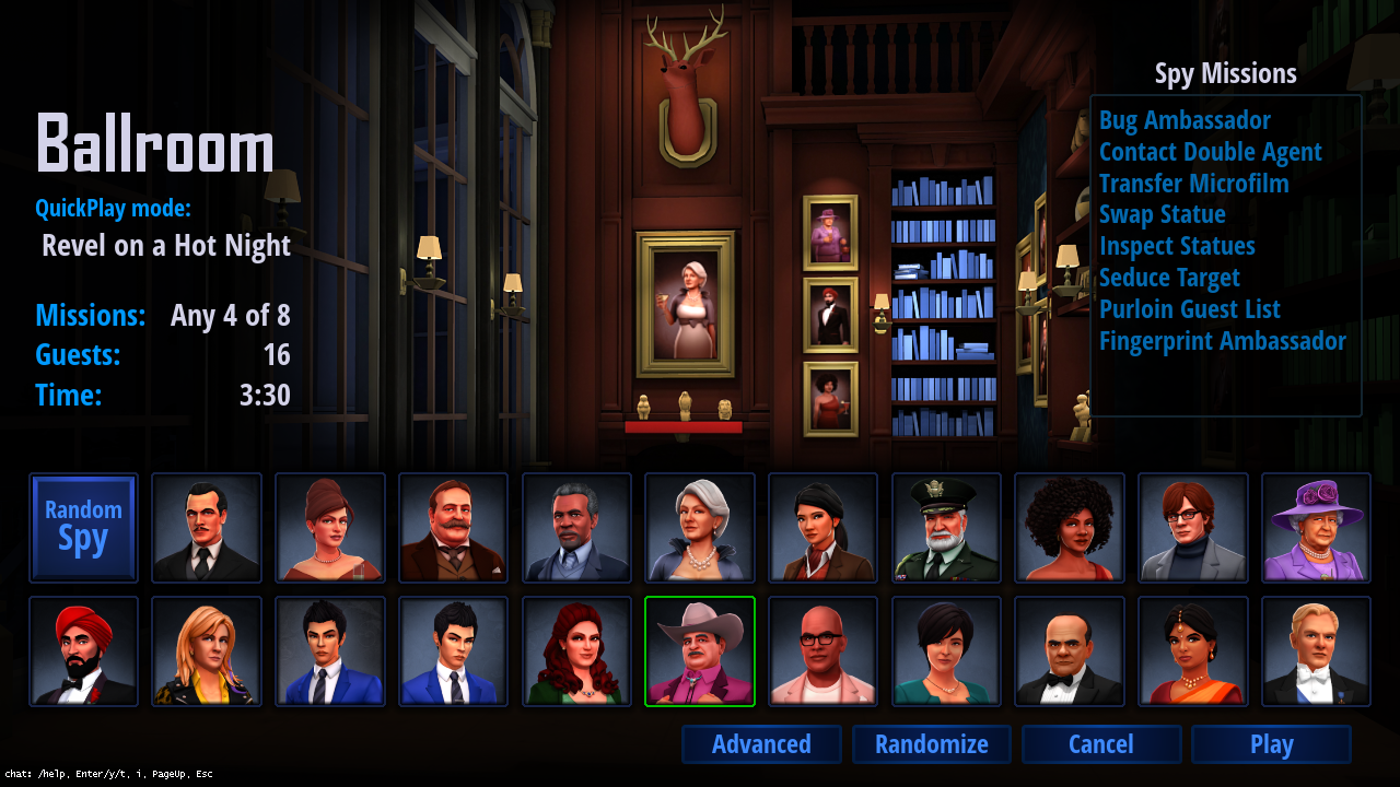
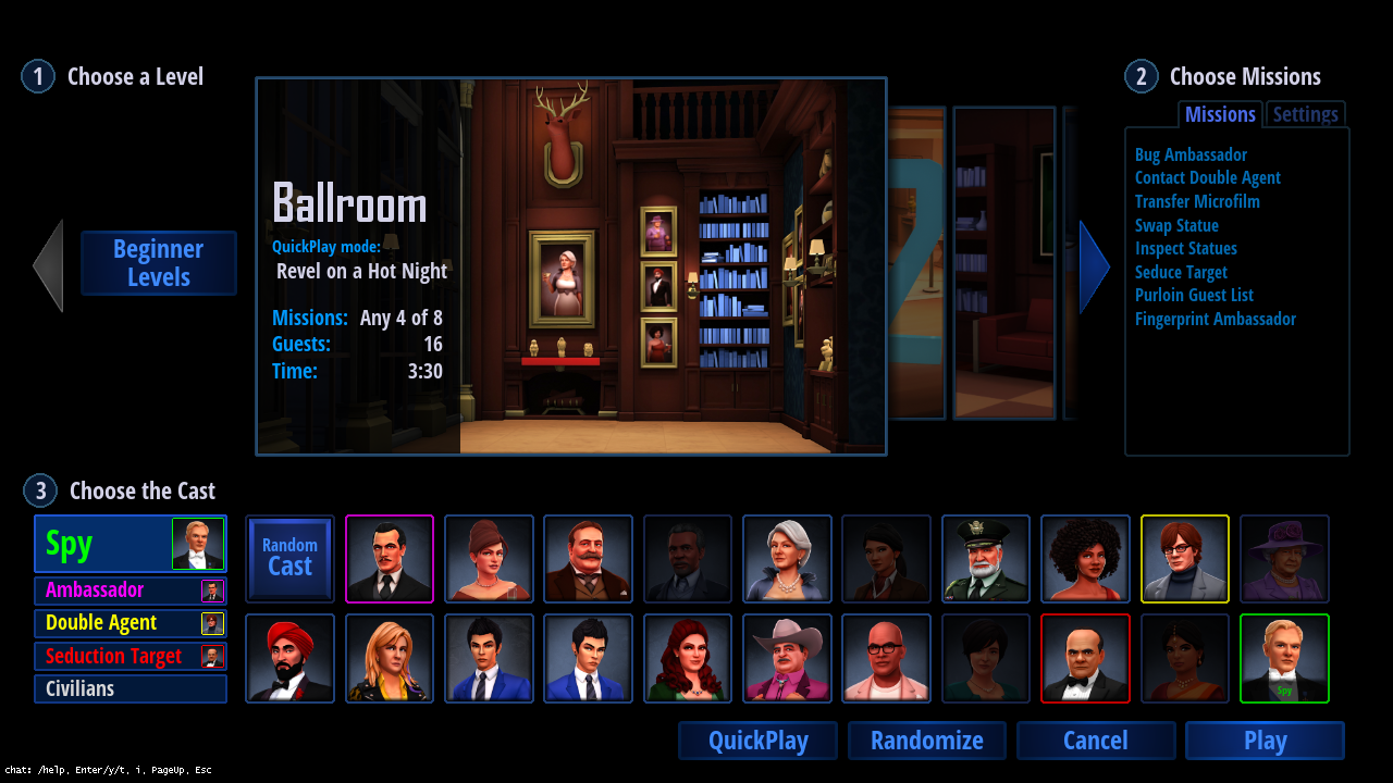
Or, at least we tried to punt. I figured a lot of the time people would just want to get into a game quickly, and having a randomly picked level with a balanced game type would be good enough. We codified this into the idea of QuickPlays, which are descriptions of maps and mission loadouts that are balanced according to the current meta, and then we made a QuickPlay setup screen that would just pick from these with only a few options. Then we also made an Advanced screen that had all the knobs on it, letting players fully customize each game. Here are the two screens we came up with:
QuickPlay Game Setup Screen
Advanced Game Setup Screen
The Advanced screen had this amazing level selection control I wrote based on a control from the Call of Duty Black Ops 3 Specialists selection. You can check it out in this TotalBiscuit YouTube video. I improved upon it greatly3 by making it silky smooth with no pops and nice ease curves everywhere, and, well, I was very proud of it and I don’t even want to know how long I spent working on it…
My precious…
Things started to fall apart when it became clear people wanted to be able to choose their level on the QuickPlay screen; the screen was just a hair too simple without that. I tried to figure out how to put some level selection in there, and did a bunch of mockups, some of which you can see here:
By this point, the QuickPlay screen was rapidly turning into the Advanced screen, and it was obvious it would be better if I could just figure out how to merge them completely.
There were three big features on the Advanced screen that needed to be merged:
the level selector
the mission and game settings panel
the cast selection widget
As they always say, you have to be willing to kill your babies, and the level selector was definitely my UI baby, but it needed to die. The full-bleed image with overlays on the QuickPlay screen was clearly superior design to the boxed and segmented layout of the Advanced screen, and I could not figure out how to do a full-bleed version of the level selector that wasn’t terrible, so I had to kill it. It had some other problems, like O(n) selection time, which is annoying even with acceleration, so the new widget for selecting the level at which we finally arrived has small icons you just click on and it changes directly to them. Still, I’ll always have a place in my heart for the funky slidey wacky level selector.
The mission and game settings panel could drop right into the QuickPlay screen with tabs behind the mission choices, so that was no big deal. The one subtle thing with this panel was I didn’t want beginners to even know the settings were there (you can now control all sorts of things that can mess up the balance of a game, like number of guests, which missions are prohibited, duration of the game, and more soon), so I extended the QuickPlay format the include groups, which is cool because now players can make their own for things like the SpyParty Competitive League allowed-map set, and then also “locked” groups, so the Beginner QuickPlay Group is locked and the missions or game settings simply aren’t editable and there is no tab for settings at all.
Finally, the cast selection widget—which allowed you to choose whether you were changing the Spy or the Double Agent or any of the other cast—was not pulling its weight, and having the current cast be modal felt bad anyway, and didn’t scale well to casting roles with multiple members, like the newly enabled ability to control exactly which Civilians were guests at the party. To fix this, I switched to a kind of Super Smash Bros drag-the-role-around UI, so I could just kill the widget completely, which feels much better and looks cleaner.
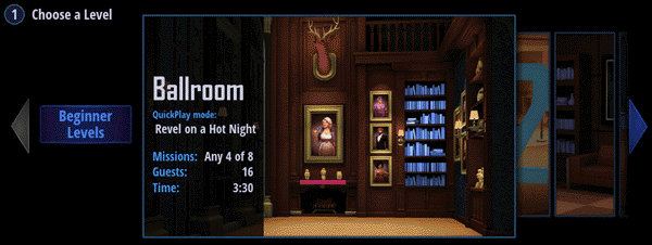
Here’s the finished4 version of the new merged game setup screen that will hopefully please all the people all the time:
I’m just sure this is the final UI and is perfect…
That thing at the top is called the “level icon selector” and it slides down when you’re near it or over the level information on the side:
It is juicy, but not as juicy as the old one…*sniff*
Miscellaneous Stuff
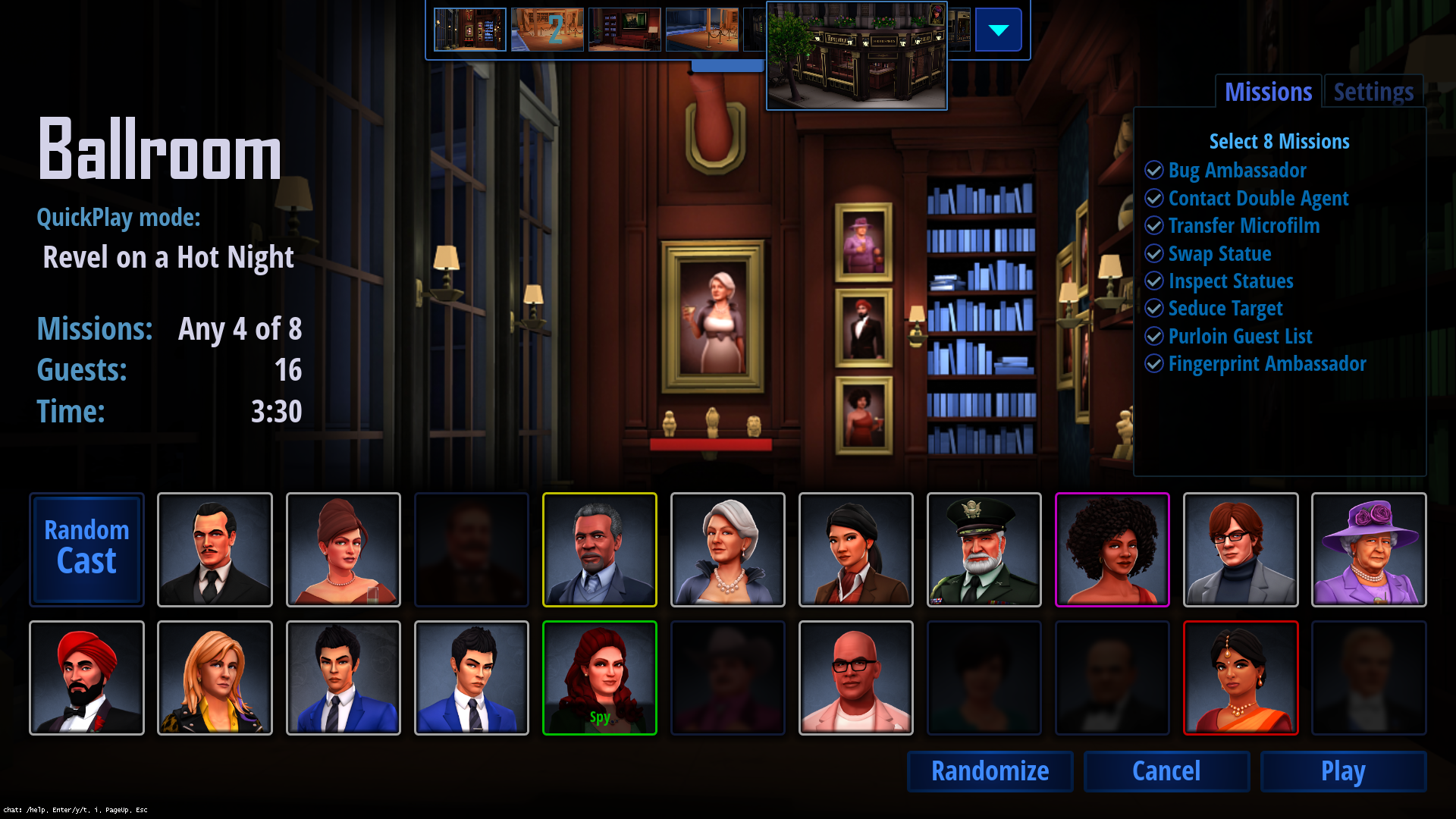
One thing you might have noticed in the gallery of new UI images at the top of this post is the Dossier screens. Right now, this is where the “practice preview” stuff went, where you can look at the mission tells from various angles and get information about the different Action Tests. This will be a big part of the deeper game eventually, including some crazy ideas partly inspired by Papers, Please.
Dossiers! Lots of placeholder stuff for now!
Another somewhat interesting anecdote about how important real testing is: during development of the new UI, I setup and sometimes played hundreds of fake games against myself to test for usability and bugs, but it wasn’t until the UI was released that I actually played a real match (against steph for her 5k birthday and 1 year anniversary!) and I immediately missed something that should have been obvious in retrospect.
Before this update, when a game would finish by either a shot or timeout or the Spy completing missions, the replay for the game would immediately load. It was anti-climactic, but the replay screen includes lots of interesting information, as you can see:
The replays screen isn’t going to get a new UI treatment for a while.
We aren’t going to redesign this screen for a while, and we wanted a cleaner and more dramatic results screen so there was a clear end to the game, so we designed this:
I should query the total number of civilians shot again…
It’s nice and clean and has some animation, and adds the overall score from the match. However, it is missing the highlights and lowlights, which are usually the first thing I’d look at! As a Spy, you want to know if you were highlit or lowlit to know how much suspicion you had on you, and as a Sniper you want to know whether you had the Spy as a suspect even if you shot the wrong person or they won via mission completion. With this new results screen you have to hit the Watch Replay button to find this out. So, I’ll be adding “lights” to this screen soon, and I think that’ll be the knee of the curve for game results information.
Finally, here’s the original new UI reveal video, which has lots of information on the development and shows some early mockups too:
Keyboards and mice are more popular for PC players, but they’re a disaster at tradeshows, needing more space and being less reliable. [↩]
Which would have been handy since John prototyped it in Flash. [↩]
This is the first in a series of three posts about The “Should Have Been Three Updates” Update, which, as you can probably tell from the name, was really too big for a single update. This post is about the new fancy version of the Veranda level. The next post will be about the new user interface we’re moving towards. The final post will be about the five new characters.
We have updated the Veranda level to the new art style! Check out the difference with the fancy draggy slidery image comparer:
You can drag the handle in this image to compare the versions!
Until relatively recently,1 we had the beta-tester-beloved classic “old art maps” (Balcony, Ballroom, Courtyard 1 & 2, Gallery, Panopticon, and Veranda), and the totally separate fancy “new art maps” (Modern & Double Modern, High-rise, and Pub) done in the new environment art style. The old art maps were all tuned and balanced for competitive play, and—equally important—people were used to them, but the new art maps hadn’t been battle-tested to the same extent, and players were still figuring out how the new art characters and maps worked for competitive play.
Of course, everybody knew the old art’s days were numbered, since SpyParty is going to eventually look like a real professional quality video game™, and that meant we’d have to start doing new art versions of all the existing old art maps. We finally bit the bullet and converted the original level, Ballroom, and that worked out pretty well…it played pretty similarly to the old art version, and after a bit of tuning it was accepted into the competitive pantheon.
Well, now we’ve gone and done Veranda.
It didn’t go quite as smoothly as Ballroom.
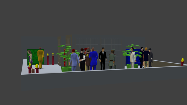
First off, the Veranda level itself is a lot more complicated than Ballroom. When making maps for SpyParty, we’ve been trying to explore the level design space, meaning we think about the various characteristics that make up how a level plays, so obvious things like the level’s shape, but also sight lines, how much occlusion there is and what kind of occlusion it is, and more. Ballroom was basically a box with windows on two sides. Some things were easier to see from some angles, of course, but you could basically see the entire map from any Sniper position. It primarily had “dynamic occlusion” from characters walking around at the party.
For Veranda, I wanted to make a big level where the Sniper couldn’t see the whole playable area at the same time due to the intrinsic shape of the map.
A hastily created map of Veranda’s layout.
As you can see, the green and red bookshelves are on one side, and the blue bookshelf is on the other side, with the center protrusion blocking the view from either side. Veranda has gone through some iteration since it was introduced way back in 2011, but the core “static occlusion” concept it was exploring stayed the same.
We’ll come back to whether it was a successful exploration of this design concept a little later in this post, but one thing we’ve learned is that converting old art maps to new art is made more challenging because we have to work within the often-poorly-thought-out layout that I initially threw down for prototyping, where I was not thinking about whether this was a building that could exist in the real world, I was just trying to make an interesting video game level. Sadly, that’s not enough when the fidelity of the art is cranked up. In other words, we want to keep the finely tuned gameplay the same as the original map—or at least try to hit it as close as possible—so we want to keep all the shapes in the level the same, but that means we have to work with my original proportions, even if they didn’t make much architectural sense.
I definitely had sipping Mint Juleps on a Southern Colonial mansion veranda in mind when doing the original version, but my scales were all over the place, and that center occlusion area makes basically no sense in a real building, so we had to improvise.
First, we always look for reference images. We relatively quickly found a bunch of amazing Southern Colonial buildings with verandas, but The Governor’s House Inn in Charleston stood out as particularly inspiring, plus we accidentally discovered by a misclick that you can walk around and even into the building on Google Maps!
The Governor’s House Inn in Charleston
Then we tried to figure out how to get the shapes right, not to mention explain why there would be bookcases on an outdoor veranda. Books and Atlantic hurricanes don’t mix very well.
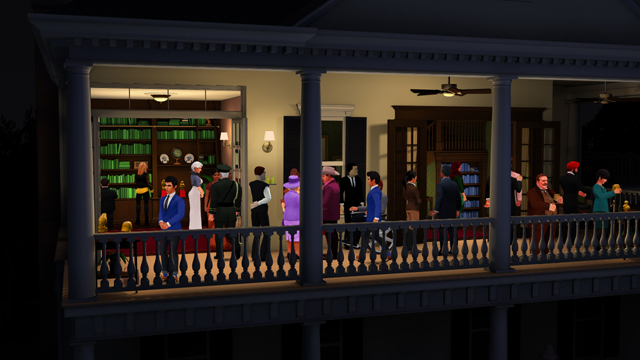
We decided to take a cue from the Governor’s House Inn, which has a remodeled section on the right, and we enclosed the left side into a sunroom library, and then had the right side of the level be actually inside the second floor on a landing, and the veranda keeps wrapping around the house but is blocked off for guests (and is lit accordingly).
The new art Veranda layout.
Here’s another fancy slider so you can see the view on the right side of the level…
You can drag the handle in this image to compare the versions!
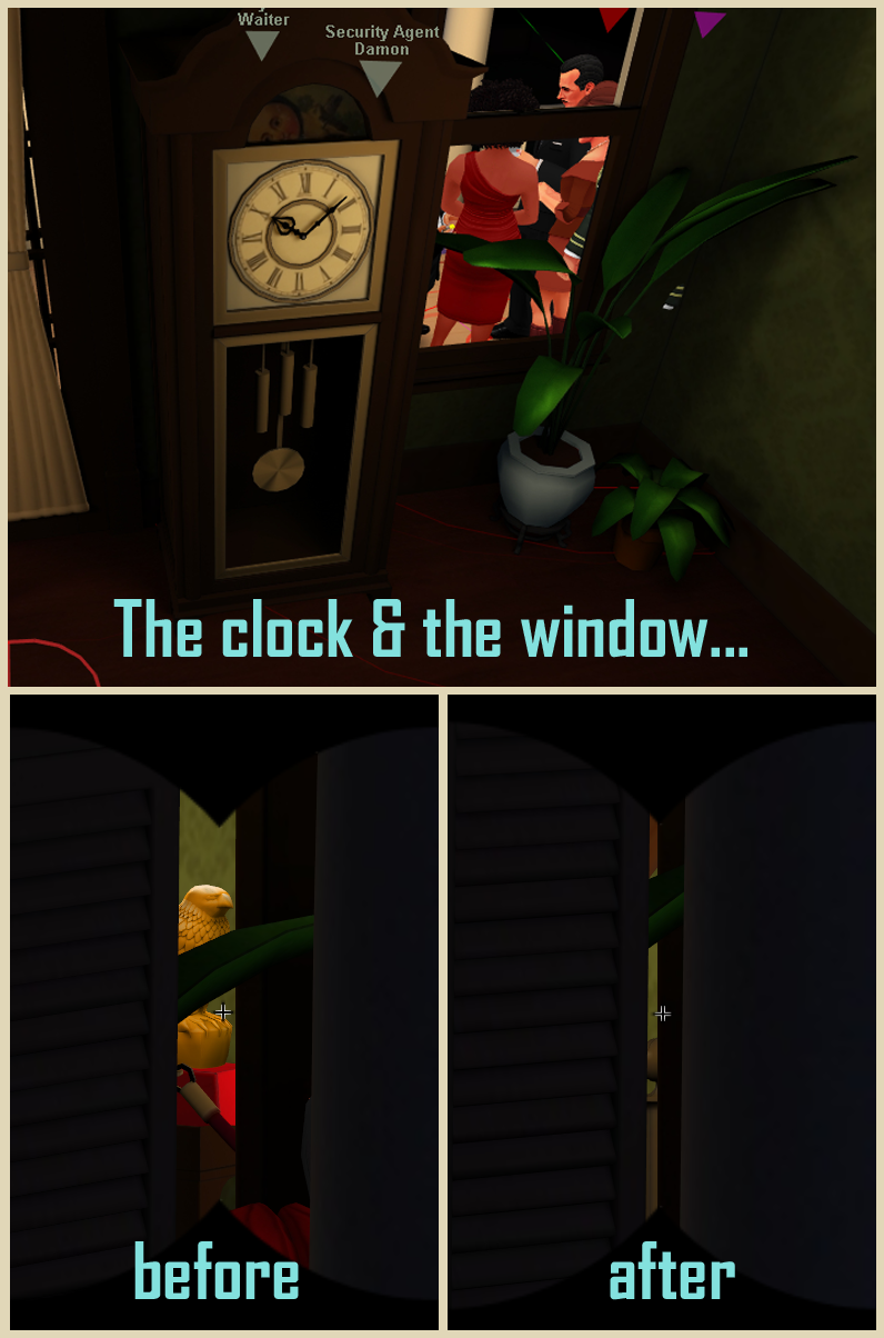
One kind of funny minor issue we had was the front window, near where the security guard stood, allowed the Sniper to see one of the interior statues, so we had to move the clock a bit forward.
I may have referred to this as “clock blocking”. Maybe.
Another issue with the earlier tests of the new Veranda was I had the Sniper camera too high, which we didn’t notice during development or in the chaos of testing a PAX, but once the level was released and people started playing it in earnest it became clear the Sniper had a commanding view of the party and too much of an advantage. As krazycaley said in the forums, “This is IMMENSELY important for filthy campers2 – it is FAR easier to guard statues on New Veranda than it was on Old Veranda.”
Sweet(er) Spot
Those problems and a few other minor issues were easily fixable, and beta testers report the level is working now, but there is a bigger problem that is not easily fixable and so is going to have to wait: the core design question the level is exploring is not being explored very well because there’s a “sweet spot” where the Sniper doesn’t have to move very much to see everything. And the new art version made it worse.
If you sit near the front-left of the level, you can see enough of the three bookshelves to catch Spies doing microfilm animations, and even though you can’t see the statues on the far right, you can trivially see anybody who goes there and so can check on the statue situation without moving too much.
To compound the problem, we changed the field-of-view of the Sniper camera between the Courtyard 1 and Courtyard 2 levels before we started doing new art levels, to make it look a bit less distorted and give the Sniper a better feeling of being outside and looking through a telephoto lens of some sort. This flattened the depth, which ends up magnifying stuff in the distance in a sense. This made looking at the bookshelves and the statues from the Veranda sweet spot even easier! You can see the difference in this comparison I made with the old art to make it easier to focus on the field-of-view difference:
FOV Comparison.
You can drag the handle in this image to compare the versions!
To fix this I think we’re going to have to modify the level and put the blue bookshelf deeper inside the house, probably around the corner, thereby requiring the Sniper to move to check it.
As if that wasn’t enough Sniper buffs, there was a “wallhax” exploit in the old art Veranda which allowed the Spy to put their camera into the wall and the whole level would turn translucent, giving the Spy much better situational awareness of important things like whether a Double Agent is in a conversation, where the Ambassador is standing, and the like.
Not pretty. Useful, but not pretty.
I am not going to turn this on for the new art, just on principle. I want the new art to feel solid and even once we have a better graphical treatment for how walls go to translucent when the camera interpenetrates them, we’re not going to let the entire map go translucent like this.
To fix this one, I think I’m going to introduce a way for the Spy to pull out and see the entire level from the top as a 2D map with icons, kind of like the image farther up this post. This is all preliminary, but this could be an interesting Spy buff that allows us to put other information on the map view. We’ll let this simmers on the back burner in the old design pot for a while.
So, that’s the story of the new Veranda! If you’re in the beta, just load up the game and hit Play and the update will download and you can check it out. If you’re not in the beta yet and would like to be, head over to the order form and sign up!
Well, “recently” relative to the absurdly long development of SpyParty. [↩]
krazycaley is of course the king of the filthy campers. [↩]
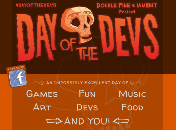
Hey, sorry for the late notice, but it looks like we’re going to be a bit shorthanded at Day of the Devs this Saturday, November 5th, and we could use some help!
If you like SpyParty and are available from 1pm-10pm on Saturday in San Francisco (or a significant subset of that time block), please mail me at support at spyparty dot com and let me know a little about yourself. You’d be teaching people how to play the game, but it doesn’t matter if you’ve played before since we’ll teach you how to teach people. Obviously, if you have played SpyParty before that would be best, but it’s not crucial.
If you’re a booth helper you’ll get the immense satisfaction of introducing people to a video game, camaraderie, a free sore throat from talking too much, all the throat lozenges you can eat, a food truck dinner, and you’ll get a cool codecard with your choice of character, which also contains a free copy of the game (which you can gift to somebody if you already own it)!
So, shoot me a mail if you’re interested, thanks!
Category: events, indie games |
Comments Off on Need Booth Helpers for Day of the Devs in SF, Saturday, Nov 5!
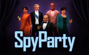
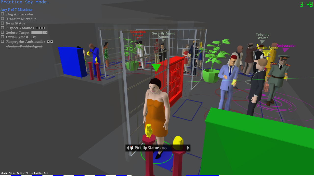
SpyParty is a spy game about human behavior, performance, perception, and deception. While most espionage games have you spend your time shooting stuff, blowing stuff up, and driving fast, SpyParty has you hide in plain sight, deceive your opponent, and detect subtle behavioral tells to achieve your objectives. Unlike the suave and confident spies you might find in films or books, most spies in spy games are more like super powered commandos--more Rambo than James Bond. By contrast, SpyParty is a new and quite different game about the more interesting and deeper aspects of being a spy.
Can I play it?
Yes, at least in beta form! Head over to the Early-Access Beta Page for details!
SpyParty is currently in active development, but there is no ship date yet, and there won't be for a while, because I want to make it perfect! All of the art you see on this website is placeholder art for the gameplay prototype! This blog documents the game's progress. Feel free to leave questions and comments, and I'll try to reply.
Also please tell your friends about the game, and follow the game on Twitter or Facebook. Indie games like SpyParty depend on fans to spread the word. Thanks!


